Not Found
Not Found
Not Found
Not Found
Not Found
Not Found
Not Found
Not Found
Not Found
Not Found
Not Found
Not Found
Not Found
Not Found
Not Found
Not Found
Not Found
Not Found
Not Found
Not Found

Submitted

Responsive Landing Page using media queries

@Chiblessed

Desktop design screenshot for the QR code component coding challenge

This is a solution for...

  • HTML
  • CSS
1newbie
View challenge

Design comparison


SolutionDesign

Solution retrospective


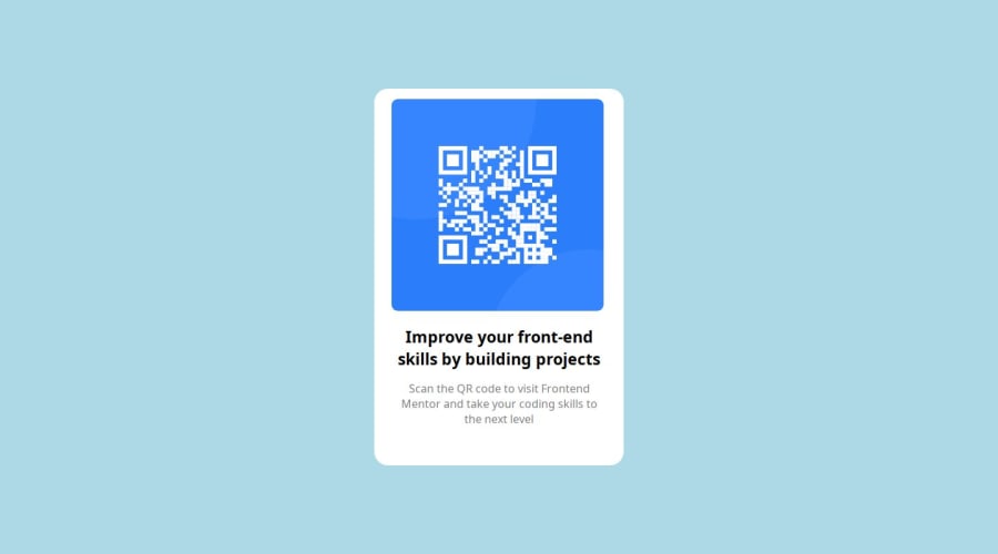
During this, I found making the QR component responsive as every screen has a different width and targeting this width can be difficult. Personally, I am not sure of the responsiveness of this project on mobile.

Community feedback

@Ezekiel225

Posted

Hello there 👋 @Chiblessed.

Good job on completing the challenge !

Your project looks really good!

I have suggestions about your code that might interest you.

Consider changing the background-color of the body element to hsl(212, 45%, 89%).

body {
  background-color: hsl(212, 45%, 89%);
}

I hope it helps!

Other than that, great job!

Happy coding.

2

@devid8642

Posted

Firstly, congratulations on the solution.

I have some suggestions for your project:

Consider structuring all the content on your HTML page using semantic tags, in this case <main> and <article> for the card. See more about semantic tags here.

It's not interesting to use tags like <br> to position like you did, consider doing this in CSS because it breaks your layout. As you centered the card using position, depending on the display, the texts may end up leaving the card.

I recommend that you remove the <br> and to center the card use the following, considering the card inside <main>:

main { /* or .container */
   display: flex;
   align-items: center;
   justify-content: center;
   min-height: 100vh;
}

Centering the card without using position and removing <br> will certainly ensure that the layout is more uniform across existing display varieties and facilitate responsive design.

Even though you applied the sources to the project, you did not upload the assets directory to GitHub and therefore they do not load on the page.

As this is a simple project, the responsive design probably became a problem due to the layout techniques you chose to use, I recommend using flexbox to center the card and without using <br> to position the texts (research the property text-wrap) you probably won't even need to apply any additional CSS rules in the mobile media query, just change the width of the card.

I hope you found my comment useful, again congratulations on the solution.

1

@Chiblessed

Posted

Thank you so much. It was really helpful @devid8642

1

@Chiblessed

Posted

Thank you so much. It was really helpful @devid8642

1

Please log in to post a comment

Log in with GitHub
Discord logo

Join our Discord community

Join thousands of Frontend Mentor community members taking the challenges, sharing resources, helping each other, and chatting about all things front-end!

Join our Discord