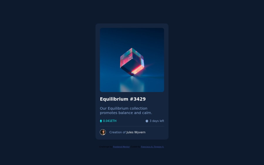
Design comparison
Solution retrospective
I got stuck at overlaying two divs and making it to hover like in the challenge. It was nice challenge but I think there's a way much easier than I use. Feedback will be much appreciated!
Community feedback
- @HassiaiPosted almost 2 years ago
wrap <div class="attribution"> in a footer tag and replace <h2> with <h1> to fix the accessibility issues.
To center the main on the page, add min-height:100vh; display: flex; align-items: center: justify-content: center; or min-height:100vh; display: grid place-items: center to the body.
To center the main on the page using flexbox: body{ min-height: 100vh; display: flex; align-items: center; justify-content: center; }
To center the main on the page using grid: body{ min-height: 100vh; display: grid; place-items: center; }
There is no need to give main a min-height, height and margin values.
For the overlay there is no need for <div class="active-img"> in <div class="hover-img">. in the css give .header-img a width of 100% and position: relative give the img a width of 100% and display: block and give . hover posit: absolute, top:0, left: 0, right: 0; bottom : 0 background-color of cyan and opacity of . Give .view postion: absolute, left: 50%, top: 50%; and tansform: translate(-50%, -50%).
.header-img{ width:100%; position: relative; } img{ width:100%; display: block; } .hover-img{ position: absolute; top: 0 left:0; right:0; bottom: 0 background-color: hsl(); opacity: 0; } .view{ position: absolute; top: 50%; left:50%; transform: translate(-50%,-50%); } img:hover .hover-img{ opacity: 0.9'; }
Hope am helpful.
Well done for completing this challenge. HAPPY CODING
Marked as helpful0 - @sandro21-glitchPosted almost 2 years ago
Hi Pompey-hub
Here are a few suggestions for improvement your code
Semantic HTML:
Consider using semantic HTML tags like header, section, article, footer instead of div for better accessibility and structure of your code.
Accessibility:
Add alt attributes to all images for better accessibility.
Use CSS flexbox for better alignment and responsiveness. CSS Flexbox
Write more specific selectors instead of using universal selector(*). This makes the code more readable and maintainable.
Use tools like Autoprefixer to add vendor prefixes for compatibility with different browsers.
Happy Coding
Marked as helpful0
Please log in to post a comment
Log in with GitHubJoin our Discord community
Join thousands of Frontend Mentor community members taking the challenges, sharing resources, helping each other, and chatting about all things front-end!
Join our Discord