

Design comparison

Solution retrospective
Good day, please can my code be reviewed, I didn't really have any issue with this, but could there be a better way to do this? Thank you in anticipation
Community feedback
- @RadexmanPosted about 2 years ago
Hi there! I checked your code and it is really good! The only thing I saw is a quite minor one, you named your classes “second”, “third” and “fourth” which is neat and short but it is not semantic so that we don’t know what “third” is. It is good practice to write short self-explanatory names for our id’s and classes so that other devs would understand our code better. Here is some good resource on that subject:
https://stackoverflow.com/questions/1790455/whats-the-best-way-to-name-ids-and-classes-in-css-and-html
I hope that was a little bit helpful for you! Good luck on next projects and happy coding!
Marked as helpful0 - @PhoenixDev22Posted about 2 years ago
Hi Edwin Jonathan,
Congratulation on completing this frontend mentor challenge. Your solution looks great. I have some suggestions regarding your solution:
Question: why did you use a
<section>?According to MDN ,
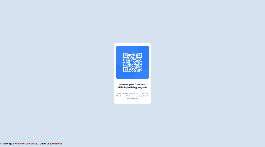
<section>is a generic sectioning element that is used whenever it doesn’t make sense to use the other more semantic ones. ** It is a container that stores self-contained content that still makes sense when placed in a different context.**If you are only using the element as a styling wrapper, use a <div>. You can read more in CSS tricks- In my opinion, the alternate text is needed on this image. The alternate text should indicate where the Qr code navigate the user : like
QR code to frontend mentornot describes the image.
- Adding
rel="noopener"orrel="noreferrer"totarget="_blank"links. When you link to a page on another site usingtarget=”_blank”attribute , you can expose your site to performance and security issues.
- In order to center the card on the middle of the page , you can use the flexbox properties and
min-height: 100vhfor the<body>add a little padding to the body that way it stops the card from hitting the edges of the browser.
height: 300px;It's not recommended to set height to component, let the content of the component define the height.
width: 200px;An explicit width is not really a good way to get responsive layout . consider usingmax-widthto the card inreminstead .
- Consider using rem and em units as they are flexible, specially for font size better to use rem. If your web content font sizes are set in absolute units, such as pixels, the user will not be able to re-size the text or control the font size based on their needs. Relative units “stretch” according to the screen size and/or user’s preferred font size, and work on a large range of devices.
- Remember a css reset on every project. That will do things like set the images to display block and make all browsers display elements the same.
- Using percentages for widths, using max-width and avoiding to set heights for the components, with these things is the key to mastering responsive layouts.
Aside these Great job on this one. Hopefully this feedback helps.
Marked as helpful0@ElektrokatPosted about 2 years ago@PhoenixDev22 i love this review with detailed explanation, we learn every day, thank you very much
0 - In my opinion, the alternate text is needed on this image. The alternate text should indicate where the Qr code navigate the user : like


Please log in to post a comment
Log in with GitHub
Join our Discord community
Join thousands of Frontend Mentor community members taking the challenges, sharing resources, helping each other, and chatting about all things front-end!
Join our Discord