Submitted over 1 year ago
Responsive Landing Page using MaterializeCSS
#materialize-css
@blordeus
Design comparison
SolutionDesign
Solution retrospective
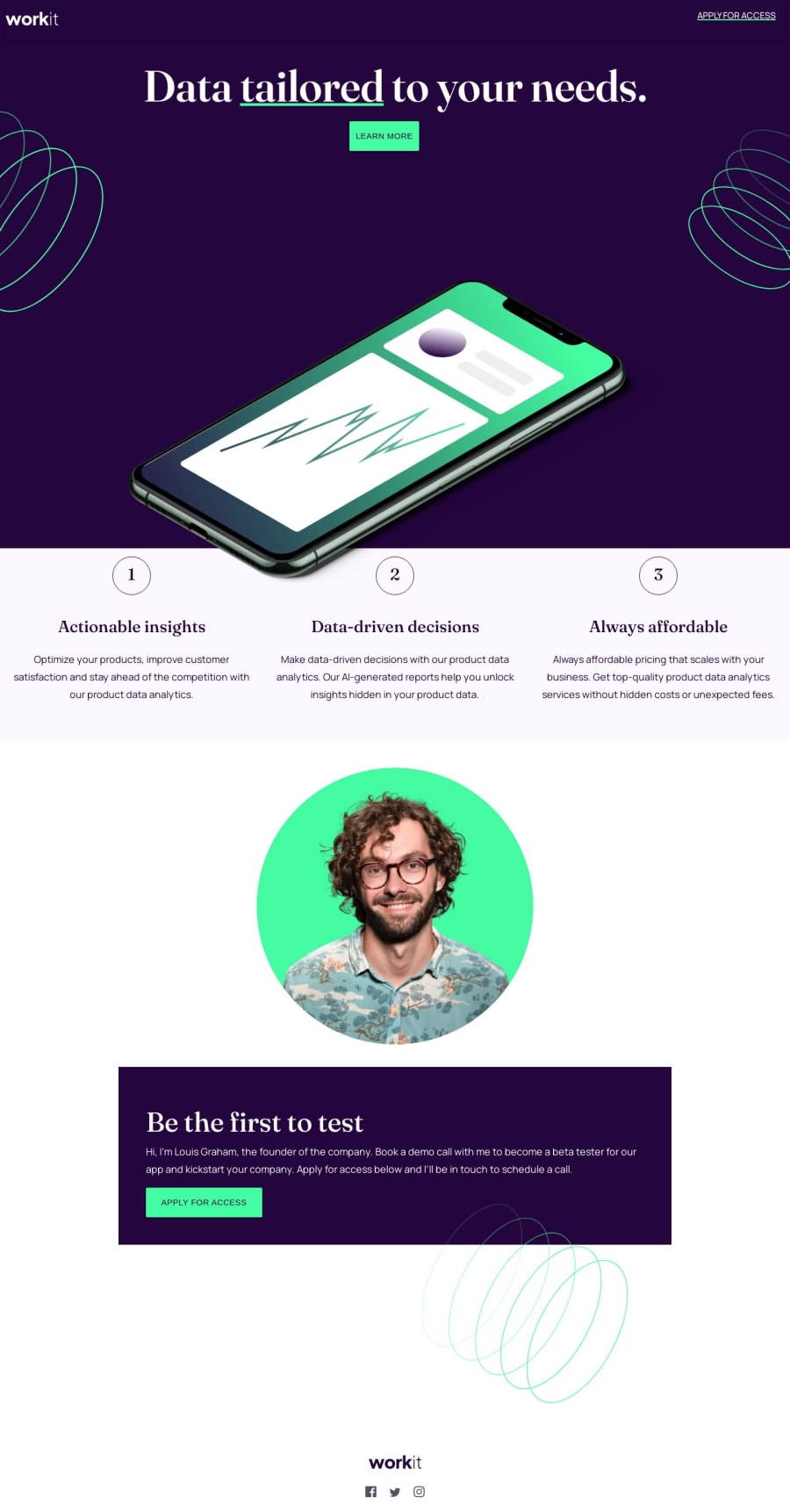
This is my first project using a framework, so it's not a complete recreation of the design. I couldn't figure out how to make a curved bottom for each section or make the elements overlap towards the end. I also couldn't make the content completely full width, so there's some white space to the right. Any suggestions would help.
Community feedback
Please log in to post a comment
Log in with GitHubJoin our Discord community
Join thousands of Frontend Mentor community members taking the challenges, sharing resources, helping each other, and chatting about all things front-end!
Join our Discord
