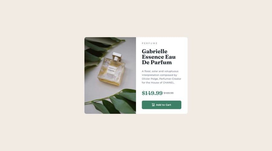


Design comparison

Solution retrospective
I hope that html and css are quite clear and readable I am not fully proud of responsivity on extra small devices, like 320x480 as it cuts my card a bit, have no idea how to fix it It took some time to catch-up on some things as I am still learning css In my opinion card looks really cool, hope that all design was reflected on most of details as I had mostly depend on my eye
What challenges did you encounter, and how did you overcome them?Uff You can check commit history haha I've messed html a bit so after a while I comprehend how important is to have a nice and clean html until we move to css Then when html was fixed css had to be written mostly from the scratch Responsive design is still bit difficult for me, trying to avoid px and use rem/vw/vh instead of it to give as much responsivity as possible but as I am learning on my own, I am not sure if all what I create is made correct way, but hey- mostly- especially on deskop sizes it working
What specific areas of your project would you like help with?How to improve responsivity of my web? I am not sure if I am moving correct way as I am learning on my own and on my mistakes, resolving any obstacle with googling for resolution only, however I am trying to understand things. Not really sure if px are a enemy of responive web design or how I should create @media in a correct way, also, how many of them should i create? Seen that some webs have few @media for different resolutions, is there an one way to find out what should be included within those media blocks of code? Please take a look on my code and let me know how it looks to you
One more thing- picture on html side, how to handle and use it in a correct way?
Community feedback
- @AmIKamilPosted 26 days ago
Could you expand on your description a bit? I've used some semantics, hope that details of my design looks right Your advise is too general :(
0@KapteynUniversePosted 26 days ago@AmIKamil You need to reply to @dariinda or they won't get a notification. I expand some:
Change div with body class with main landmark. Landmarks, (or this page) are essencial for accesibility. Every page needs one main.
I think main container div could be an article but using article just for the text seems wrong, it is a paragraph.
You don't need to wrap every single element with a div. Only div you need here is writtenPart div (maybe you can wrap picture too).
Images needs a meaningful alt text, unless decorative. For this case cart image alt text should be empty, like alt="".
For old price you can use del
Never use px for the font sizes. So people with visual impairment can adjust the font size on their browser. Use rem for especially font sizes and media queries.
Use border: transparent instead of border: none; for accesibility issues. Also for future projects: don't use outline: none, make sure to add a custom styling for outline if you have to use none.
Also i don't understand why but texts are blury for some reason.
You can check this article about this challenge or Kevin Powel's video.
Marked as helpful1@AmIKamilPosted 26 days ago@KapteynUniverse Thank you for your comment, it is really meaningful I will definitely use your tips in all my future projects
1 - @dariindaPosted 27 days ago
Yeah, you have done a great work. Things to look upon :-
- Use semantic tags these will help you to add css faster and ranking your website also.
- Try to work on details, make it look exact like the given one.
- Other than these points, you are good with the code thing, nomenclature is also good.
0


Please log in to post a comment
Log in with GitHub
Join our Discord community
Join thousands of Frontend Mentor community members taking the challenges, sharing resources, helping each other, and chatting about all things front-end!
Join our Discord