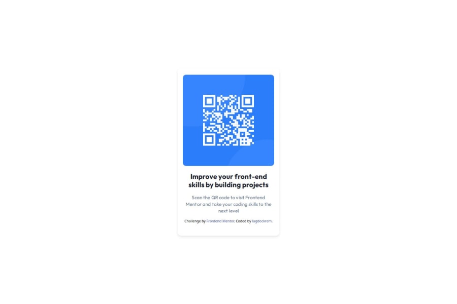
Design comparison
Solution retrospective
I don't find anything particularly special in my code that I could be proud of.
I would be delighted to study any colleague's code if they agreed to share it. It's quite likely that I'll adopt coding approaches in the future that I'm not currently aware of.
What challenges did you encounter, and how did you overcome them?I haven't quite figured out the variables like
:root { --color-blue-600: #007bff; --color-slate-900: #1a202c; --color-slate-500: #64748b; --font-family: Outfit, sans-serif;
But that's not a big problem for me. I just don't have enough time to figure it all out.
What specific areas of your project would you like help with?Sorry, but it's difficult for me to give a specific answer to this question. I still don't fully understand the specifics of it all.
Community feedback
- @danielmrz-devPosted 4 months ago
Hello there!
Congrats on completing the challenge! ✅
Your solution is really impressive!
I've got a couple of ideas (about how to use HTML better) that could make it even stronger:
📌 First: Think about using
<main>to wrap your main content instead of<div>.Imagine
<div>and<span>in HTML as basic containers. They're good for holding stuff, but they don't tell us much about what's inside or its purpose on the webpage.📌 Second: Consider employing
<h1>to<h6>tags for headings rather than using<p>.The
<p>tag is primarily intended for paragraphs. When it comes to headings, HTML offers us a range of heading tags: from<h1>to<h6>.Here's a quick guide on how to use them:
- The
<h1>to<h6>tags are used to define HTML headings. <h1>is for the most important heading.<h6>is for the least important heading.- Stick to just one
<h1>per page – it should be the main title for the whole page. - And don't skip heading levels – start with
<h1>, then use<h2>, and so on.
It's more than just text size — it's about structuring your content effectively.
These tweaks might not change how your page looks, but they'll make your HTML code clearer and help with SEO and accessibility.
Hope that's helpful!
Keep up the great work!
Marked as helpful1 - The
- @lugdockremPosted 4 months ago
Hi, Daniel!
According to your recommendations, I improved the markup using tags <main>, <footer> and <h1> . I also removed the footer at min-width: 1440px.
Thank you so much.
0
Please log in to post a comment
Log in with GitHubJoin our Discord community
Join thousands of Frontend Mentor community members taking the challenges, sharing resources, helping each other, and chatting about all things front-end!
Join our Discord
