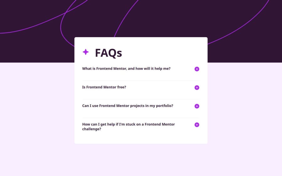
Responsive landing page using HTML5, Accesibility and Sass.
Design comparison
Solution retrospective
De poder crear un acordion totalmente con html y css sin usar javascript
What challenges did you encounter, and how did you overcome them?no
What specific areas of your project would you like help with?Me gustaria saber si puedo mejorar mi semantica de html
Community feedback
- @Papi84Posted 7 months ago
Overall, this is a solid implementation with room for improvement in accessibility and responsive design. Keep up the good work, and I look forward to seeing how you iterate on this project! but this what i have to noticed may be you can take a look at it
-
Semantic HTML: The use of semantic HTML is crucial for accessibility and SEO. It looks like you’re using appropriate elements like <section>, <h2>, and <button> for the accordion items, which is great. However, consider using <dl> (description list) for the FAQ structure, as it can enhance the meaning of the content.
-
Accessibility: The solution could benefit from some accessibility improvements. For example:
Ensure that all interactive elements (like the accordion buttons) have aria-expanded attributes to indicate their state. Add tabindex to make sure keyboard users can navigate through the accordion sections easily. Consider using visually hidden text for screen readers to provide context (e.g., indicating whether an answer is expanded or collapsed). 3. Responsive Layout: The layout appears to be functional, but testing it on a range of screen sizes is essential. Using CSS media queries can help adapt the styles for smaller screens. Check if the accordion behaves as expected on mobile devices, and ensure that text is readable without excessive zooming or scrolling.
-
Code Structure: The code is generally well-structured and readable. It’s great to see modular CSS and clear class naming conventions. However, consider breaking down the components further if applicable, especially if you plan to expand functionality. This will promote reusability and make it easier to maintain.
-
Design Consistency: The implementation aligns well with the provided design, but always compare against the original mockup to ensure all elements match in terms of spacing, colors, and typography. Any discrepancies can impact the overall user experience.
Additional Suggestions: Adding animations for the accordion open/close action can enhance the user experience. Consider implementing a simple state management solution to handle the accordion's open/close state more effectively.
0 -
Please log in to post a comment
Log in with GitHubJoin our Discord community
Join thousands of Frontend Mentor community members taking the challenges, sharing resources, helping each other, and chatting about all things front-end!
Join our Discord
