Design comparison
Solution retrospective
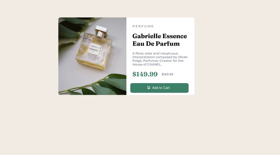
Product Preview card template feel free to check and comment my mistakes
Community feedback
- P@tesla-ambassadorPosted over 1 year ago
Hey sheikhhaseeb559, It's good to see that you have uploaded another solution. I like that you have integrated media queries into your css now! Kudos 🥳! Anyways, I looked at your css and noticed that there's a few things you could add to enable your container to be placed in the middle of the viewport. Here's some code you can add to your
<body></body>tag:body { height: 100vh; width: 100%; display: flex; justify-content: center; align-items: center; }Then you can make these changes to your
containerelement so that the previous changes can be effective... Remove the following styles from your<div class="container"></div>:.container { position: absolute; left: 300px; top: 90px; }Congrats on completing the challenge, happy coding!
Marked as helpful0@sheikhhaseeb559Posted over 1 year ago@tesla-ambassador thanks for this is very helpful for me
1P@tesla-ambassadorPosted over 1 year ago@sheikhhaseeb559 I'm glad I could help 😁
Marked as helpful0 - P@danielmrz-devPosted over 1 year ago
Hello @sheikhhaseeb559!
Your project looks great!
I have a few suggestions for you to improve it:
I noticed that you used
positionto place your card to the middle of the page. Here are two ways to do it (one of them is kinda similar to what you did):1- You can apply this to the body (in order to work properly, you can't use
positionormargins):body { height: 100vh; display: flex; justify-content: center; align-items: center; }2 - or you can apply this to the element you wanna center (almost like you did):
.element { position: absolute; top: 50%; left: 50%; transform: translate(-50%, -50%); }- I also noticed that you wrapped the main content in a
div.containerand used 2h1tags. For semantic purposes, the main content should be wrapped in amaintag. And using more that 1h1per page is not recommended. You can use oneh1for the main title andh2, h3, h4and so on. This is not just about the size, it makes your HTML more semantic.
Other than those little details, you did a great job!
I hope it helps!
2 - I also noticed that you wrapped the main content in a
Please log in to post a comment
Log in with GitHubJoin our Discord community
Join thousands of Frontend Mentor community members taking the challenges, sharing resources, helping each other, and chatting about all things front-end!
Join our Discord
