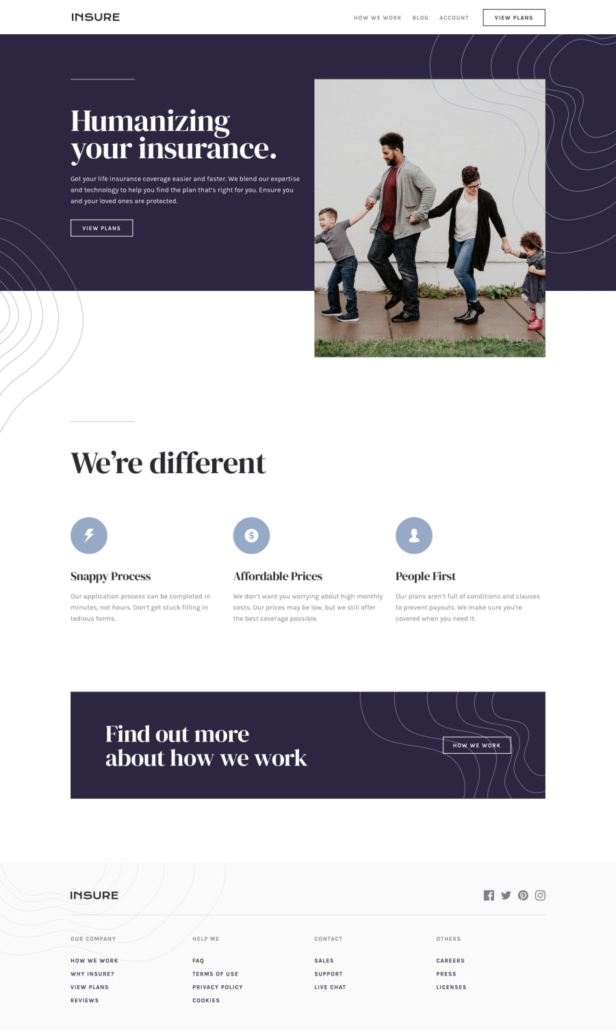
responsive landing page using html, css, bootstrap and javascript
Design comparison
Solution retrospective
I don't know how to create animations on the website. i dont really like the way it transitions. Please if you have any way to help me.
Community feedback
- @pikapikamartPosted about 3 years ago
Hey, great work on this one. Layout seems fine on desktop and mobile state. Also, since you are making the top portion fixed on the top part, make sure add
box-shadowon the bottom part so that it will create a sense of division, because right now, it is purely white, it blends to the background when you scroll and it feels the layout is too big.Some suggestions would be:
- Your
navelement should be wrapped insideheaderelement. - The
atag that wraps the website logo should havearia-label="homepage". This will make sure users will know where this link would take them. - The
altof the website logo should bealt="insure". The image already has the text, better to use it as the value. Also, avoid words like "logo, icon, image, picture" as a value onaltattribute. Assistive tech will handle those for you. - The
view plansshould be anatag as well, since it is still a link and not a control. Also, you might have notice, you put it as a direct child ofulelement. Onlylielement is can be used as a direct child oful. - You should have a
mainelement.mainelement is a landmark that will help a user to navigate properly a website. On this one, the preferred structure would be:
<header /> <main /> <footer />-
The hero section title should be the
h1and noth3. You should swap it with the second sections heading tag. -
view planon hero should beatag as well. -
The
altvalue of theimgin the hero-section should have a descriptivealtvalue, because it adds to the content of the website. -
When using heading tag, do not skip a level. If you have a
h3make sure that there is 1h1and there areh2. Use heading tag with its level only being incremented by 1.h1toh2toh3. -
On the
ctasection, thehow we workshould be link as well. -
On the
footerthe website logo should usealt="insure"as well. -
On the
footerin your css, you should avoid using/path, since it doesn't work in github. It works on our local machine but not on github, make sure it is on the right path, not using therootpath. -
Social media links in the
footershould be insideatag that are inside aulelement. Since those are list of social media links. -
The links on the
footeron the very bottom should have the same structure as well. Usingulandatag, but, the whole links should be inside anav. -
On mobile layout, the hamburger toggler should have a visual indicator like a
outlinewhen it have the focus. Right now you won't be able to see any indicator. -
The
buttonas well should havearia-label="hamburger dropdown toggler"so that users will know what thatbuttondoes. It also should havearia-expandedbeing triggered when the dropdown has appeared. -
Your dropdown should also be hidden properly. Right now, you can use
tabkey in your keyboard and even if the dropdown is not triggered, you will be directed to it, which it shouldn't do. You might need to usevisibility: hiddenthen triggering it as well tovisibility: visible.
Aside from those, great work.
0 - Your
- @felixmacaspacPosted about 3 years ago
Hey just some small feedback with the transitions, I think it would be cool if you can add ease-in transition effects for your navigation bar. So the elements would be smooth when it's being hovered. I also notice that when clicking the navigation bar (mobile) it doesn't close the whole navbar, it would be a great UX if you can also add that feature. Well done!
0
Please log in to post a comment
Log in with GitHubJoin our Discord community
Join thousands of Frontend Mentor community members taking the challenges, sharing resources, helping each other, and chatting about all things front-end!
Join our Discord
