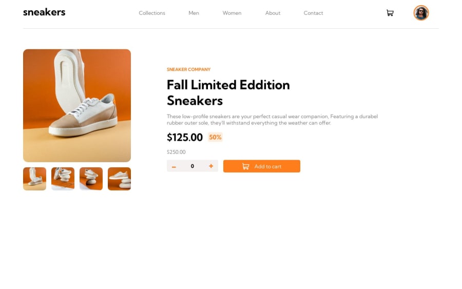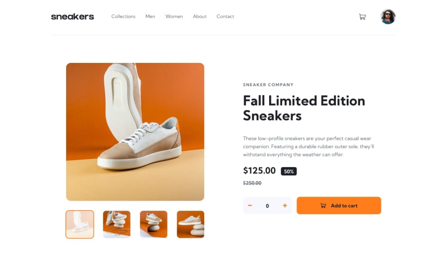
Design comparison
Solution retrospective
i haven't used vanilla js for making a website for a while since i was using react, but looking at it react is really cool it make a lot of things easier and cleaner, i think that a lot of thing can be imporved so it will be great to have any kind of advice.
Community feedback
- @servant-of-AllahPosted almost 2 years ago
Great job on your project! I really appreciate the effort you put into creating a sleek and professional design. However, I have a few suggestions for improvement:
Responsiveness: It would be beneficial to work on the responsiveness, particularly for tablet sizes. Ensuring that the website looks and functions well on different screen sizes will greatly enhance the user experience.
Consistency in item placement: While the design is visually appealing, there are a few instances where the placement of items could be more consistent. Taking some time to align elements and maintain a cohesive design throughout the entire project would make it even more polished.
Missing product image gallery: It would be great to include the gallery that opens up when users click on the product image.
Increasing cart height: Consider increasing the height of the cart to make it more prominent and noticeable.
Keep up the great work! I'm confident that implementing these improvements will take your project to the next level.
Marked as helpful0@osiz00Posted almost 2 years agovery detailed and instructive feedback, thank you for taking from your time to give me those greate advise, i understand what you have said except for the placement consistency but i will search for it thank you @servant-of-Allah
0 - @emilioQuilodranPosted almost 2 years ago
Great job on completing the project with vanilla Javascript! You have done an impressive job, and I can see that you have a good understanding of the language. However, I would advise you to base your data management solutions on user stories. For instance, you need to consider scenarios such as "when a cart is deleted, the item count should reset," or ensure event sources are accurate, like the modal component only appearing when clicking on the main image and not the checkout button.
While your HTML structure is sound in general, using user stories as guidance can help you identify and address potential issues in your code. Keep up the good work!
Marked as helpful0@osiz00Posted almost 2 years agoyeah for the "when a cart is deleted, the item count should reset," i have just realized it and added the feature , and for the modal component only appearing when clicking on the main image this sounds more logical, i will search about the user stories since this is my first time the hear about it, thank you man for the great informative feedback @emilioQuilodran
0
Please log in to post a comment
Log in with GitHubJoin our Discord community
Join thousands of Frontend Mentor community members taking the challenges, sharing resources, helping each other, and chatting about all things front-end!
Join our Discord
