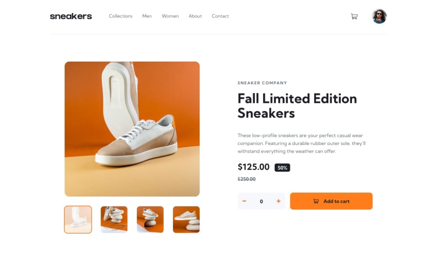
Responsive landing page using html css and js.
Design comparison
Community feedback
- @Earpz1Posted almost 2 years ago
This looks great. The page currently feels flat because there aren't any hover effects or anything to interact with. Some small tweaks around the nav bar and a box shadow on the images and the add to cart button will make this page come alive.
-
Add a border bottom to the li items in the nav bar that appears on hover using the pseudo class hover (https://www.w3schools.com/css/css_pseudo_classes.asp)
-
Box shadows can 'lift' items off a page and gives some depth. They also make good hover effects on a button to show the button can be clicked or somehow interacted with (https://www.w3schools.com/css/css3_shadows_box.asp)
-
Keeping your CSS in a separate file and importing it is preferred to having everything in a single HTML file. It improves readability of your code and keeps things cleaner. (https://www.w3schools.com/css/css_howto.asp)
The responsive elements are a nice and scale down nicely to fit smaller screens. Good job!
0 -
Please log in to post a comment
Log in with GitHubJoin our Discord community
Join thousands of Frontend Mentor community members taking the challenges, sharing resources, helping each other, and chatting about all things front-end!
Join our Discord
