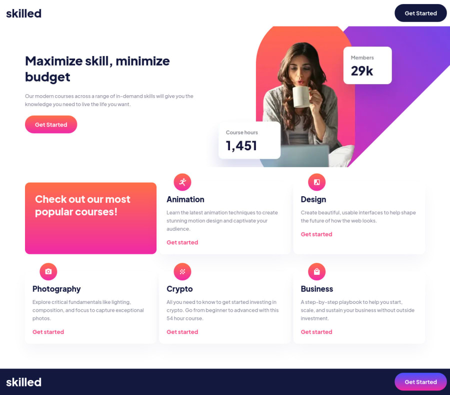
Design comparison
Solution retrospective
I tried to start this with design system which really helped with everything except the hero. I had a lot of trouble with the hero image at the tablet size, I would love if anyone could show me a better way to do this. I'm also a little insecure about the amount of media queries I have and would love feedback.
Community feedback
- @ChamuMutezvaPosted over 2 years ago
Hi Layne . Well done , your solution looks great and is responsive.
For the picture message, you do not have to declare it separately for , mobile , tablet and desktop. It should be one declaration as follows.
<picture>
    <source media="(min-width: 61.25rem)" type="image/webp"
              srcset="./assets/image-hero-desktop.webp, ./assets/[email protected]"/>
     <source media="(min-width: 61.25rem)"
                srcset="./assets/image-hero-desktop.png, ./assets/[email protected]" />
                        {/*tablet images */}
       <source media="(min-width: 38.75rem)" type="image/webp"
              srcset="./assets/image-hero-tablet.webp, ./assets/[email protected]"/>
     <source media="(min-width: 38.75rem)"
                srcset="./assets/image-hero-tablet.png, ./assets/[email protected]" />
                        {/*Mobile images */}
      <source type="image/webp"
                srcset= "./assets/image-hero-mobile.webp, ./assets/[email protected]" />
          <img  srcset="./assets/[email protected]"
                      src="./assets/image-hero-mobile.png"   alt=""   />
</picture>
source Responsive Images 101, Part 6: Picture Element
- When you are using the picture element, you do not need to use css
display: noneor any other css methods to control which image size to display - that is mainly left for the browser to interpret your html . At the moment all images will be downloaded when a user visitor uses your site. Remember the html is passed first before css - hence by the timedisplay: noneis applied all the images will have downloaded - it is expensive for the user and slows down your site(every second counts)
Marked as helpful1@laynetPosted over 2 years ago@ChamuMutezva Thanks for the feedback. Using this implementation, i'm not sure how to get my tablet image positioned correctly tho. I had it absolute positioned and now that seems to be broken.
0@ChamuMutezvaPosted over 2 years ago@laynet ,
- the figures (
min-width) are just for demostration purposes only. You still have to align with everything else with css. - the main take was about the correct usage of the picture element
Marked as helpful1 - When you are using the picture element, you do not need to use css
Please log in to post a comment
Log in with GitHubJoin our Discord community
Join thousands of Frontend Mentor community members taking the challenges, sharing resources, helping each other, and chatting about all things front-end!
Join our Discord
