

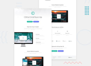
Design comparison

Solution retrospective
I am so excited to share the project I challenged myself and it helped me learn about responsiveness
What challenges did you encounter, and how did you overcome them?the biggest challenge was making it responsive but am happy it took me few hour to know but am still confused, I hope the more I do different projects the more i become better
What specific areas of your project would you like help with?I need help on getting feedback if the website is responsive to your phones too and if not, I would be happy to hear where I should work on so I can be better on the next project. Also, anyone can take a look at it and tell me what to improve, all the comments are so helpful to my growth and i cant wait to hear more. Thank you!
Community feedback
- @ShubhamOulkarPosted 12 months ago
Add more break point at 1150px for a section class="clipboard-process". Or try to use flex-wrap and gap property in flexbox. You used width=100% on most of the classes. Try other options like a vw and vh. And last always use landmarks in your design.
Everything looks great on my phone screen. 👍
0

Please log in to post a comment
Log in with GitHub
Join our Discord community
Join thousands of Frontend Mentor community members taking the challenges, sharing resources, helping each other, and chatting about all things front-end!
Join our Discord