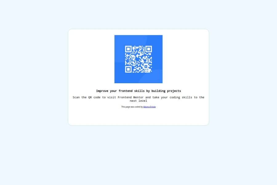
Design comparison
Solution retrospective
I am proud of the fact that i am able to do something and i will ensure to do better
What challenges did you encounter, and how did you overcome them?trying to style the page and i overcame it by searching online and asking for help
What specific areas of your project would you like help with?the css styling area
Community feedback
- @beowulf1958Posted 5 months ago
Congratulations on completing this challenge. The desktop version looks o.k.; however the container "breaks" on the phone size screen. To fix this in the styling do the following:
- Remove
font-weight: 500px;andfont-weight: 300px;Font-weight does not take a unit like pixel or rem. - Remove
font-optical-sizing: 50pxThis confuses the browser. font-optical-sizing takes either auto or none, not a number. This article will explain. - Remove the height from the container. The height will adjust automatically. If you set a height, the contents of the container will "spill out" at different screen sizes.
- Change
width: 50%;towidth: 350px;
Now the page looks better. Hope this helps.
Marked as helpful0@EnniolamiPosted 5 months ago@beowulf1958 Thank you so much for this I’d make possible changes
0 - Remove
Please log in to post a comment
Log in with GitHubJoin our Discord community
Join thousands of Frontend Mentor community members taking the challenges, sharing resources, helping each other, and chatting about all things front-end!
Join our Discord
