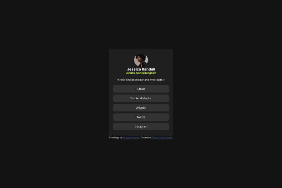
Responsive landing page using html and css
Design comparison
Solution retrospective
I am proud I was able to use grid CSS property, which reduced the need to write media queries for the screen breakpoint
What challenges did you encounter, and how did you overcome them?Well I am having challenge with the button
What specific areas of your project would you like help with?I need help with button, when I click any area outside text, it does not take me to site
Community feedback
- P@kodan96Posted 11 months ago
hi there! 👋👋
Instead of wrapping your
<a>elements into<button>elements just give<a>elements padding. Currently you are wrapping the anchor tags into buttons, so the anchors taking up just enough space to fit their content. Just remove thebuttontags give theatagspadding, thebackground-colorand you will be able to click them anywhere when you hover over them.Hope this was helpful! 🙏
Good luck and happy coding! 💪
Marked as helpful0@timidijPosted 11 months ago@kodan96 Hello, thank you, your suggestion was helpful, I have done the correction using <a> then added padding to it. Right now it looks just like the button tag. thank you so much, I appreciate.
1
Please log in to post a comment
Log in with GitHubJoin our Discord community
Join thousands of Frontend Mentor community members taking the challenges, sharing resources, helping each other, and chatting about all things front-end!
Join our Discord
