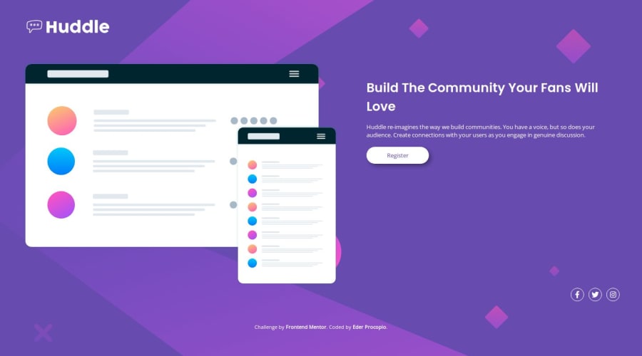
Design comparison
Solution retrospective
This was my first solo project using CSS Grid. Although it was simple, positioning the items took quite a bit of work. As it was my first time using Grid, it was also my first time implementing a mobile-first approach. To be honest, I prefer desktop-first. I chose these approaches to challenge my knowledge, and as a bonus, I got to test my problem-solving skills.
I prioritized responsiveness in the design, and because of that, I sacrificed some similarity to the original challenge. The page’s active state works very well, and all the social media icons are functional. I tried to replace the Twitter icon with the new X icon, but by the time I finished the challenge, the link to the X icon on FontAwesome.com wasn’t working.
If I had to redo the project, I wouldn’t use percentage-based dimensions for the images. While this approach adapts to various screen sizes, it distorts the page's final layout.
What challenges did you encounter, and how did you overcome them?Positioning the elements was the most challenging part, especially in the desktop design where I used CSS Grid. Additionally, I felt that I could have structured the HTML code better, which would have saved me from some unnecessary headaches.
What specific areas of your project would you like help with?I'm starting to learn programming, mostly in a self-taught way, because although I'm taking an online course, it's not the same as having tutors and friends to ask questions. I haven’t gotten my first job as a developer yet, so my main challenge is learning how to structure code according to best development practices. I also often feel unsure about whether my design looks professional enough.
Community feedback
Please log in to post a comment
Log in with GitHubJoin our Discord community
Join thousands of Frontend Mentor community members taking the challenges, sharing resources, helping each other, and chatting about all things front-end!
Join our Discord
