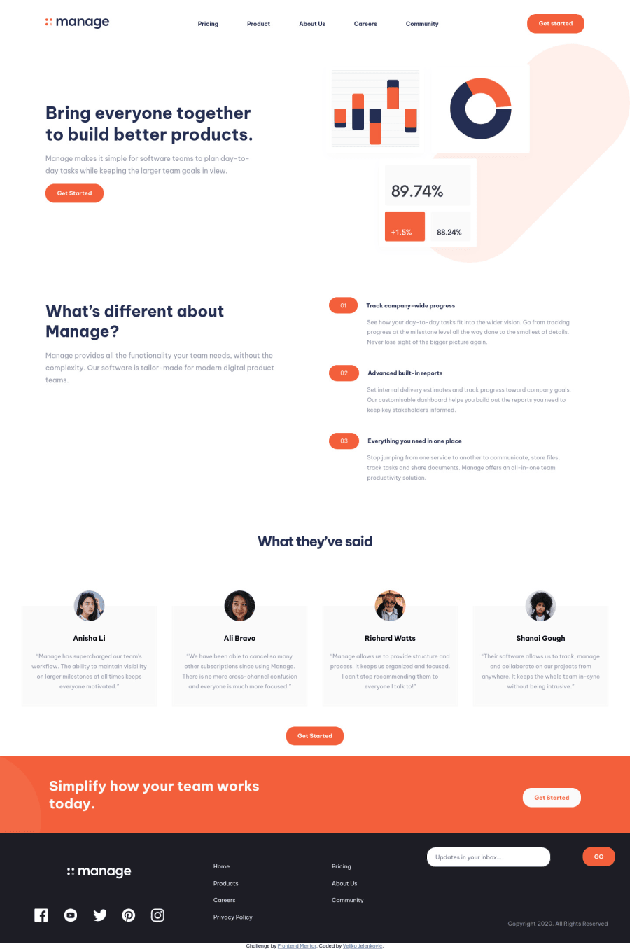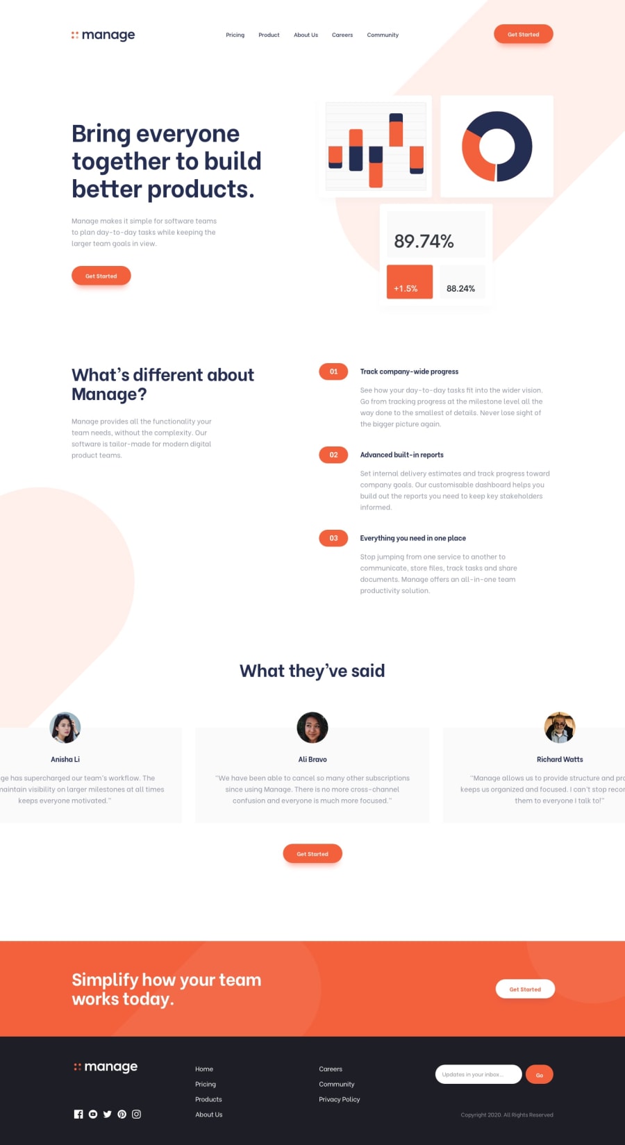
Responsive landing page using Grid, Flexbox and custom properties
Design comparison
Community feedback
- @grace-snowPosted over 2 years ago
Hi
I can see you've tagged this with #accessibility, but it's definitely not accessible at the moment. Really focus your learning in on correct html structure as it's the foundation of everything else.
Here are some issues that need fixing:
-
The logo is the most important content on the page and you've hidden it by making it a background image (also that is less performant). This needs to be in the html and needs to be labelled with the site/product name. Optionally, you could add an anchor tag around it as well, as the convention is for logos to be clickable and navigate to the homepage. If you do that the image alt would need the destination as well as the site name, e.g.
Manage - Home -
A nav toggle button must sit within the nav element and come before the nav items. This must be be a button, be clearly labelled, and have aria-expanded, with the value toggling between false and true on click (to communicate state)
-
The same goes for the close button in the nav. Tbh there is no reason you need to use 2 different buttons there.
-
Items inside a nav should really be in an unordered list. They also need to be anchor tags. So list items and anchors not paragraphs
-
"Get Started" would trigger navigation, not an action, so should be an anchor tag, not a button element
-
You shouldn't ever have sections nested within sections
-
You shouldn't have more than one h1 on a page. Heading order is extremely important for communicating the structure of a page, and many assistive technologies use the headings for navigation. Think of it like the contents page of a document
-
The
desc-articlescontent is visually a list and should be using list semantics. Those are definitely not articles. They should be list items. Once that's done your numbers can be done as pseudo elements with counters. The numbers would not need repeating in the html. As an aside, if you ever do need to use an article element, it would always have a heading -
Similar on the testimonials. They should really be figure elements not articles, with blockquotes inside for the quote, and figcaption for the person's image and name. The names are not h4s
-
Alt text should never say phrases like "picture of". It's already an image element! Make sure alt text is correct too (some have the wrong names)
-
The 'dots' can't be divs. You can't have event listeners and interactive behaviour on non-interactive elements. Those would need to be buttons, labelled with slide numbers. I would make sure they have keyboard events too so users could use right/left to slide them (sliders are notoriously tricky to make accessible and not recommended UI these days, but if it's in the design we still have to do our best with them, sadly)
-
The email form must be a form element
-
The input must have a label
-
The button should have a type of 'submit' once it is in the form. That's not essential but a good habit to get into now. Always add a type, and you'll head off bugs before they happen later on in bigger projects
-
Your footer appears to have a nav again, but you've not used a nav element, or list items, or anchor tags. Once a nav has been added here, make sure you label this nav (e.g. aria-label) as
footerand the main nav in the header asmainorsiteorprimary -
The social logos in the footer should be interactive! They are clearly clickable links so must be in the html, use anchor tags, be labelled, and in this case probably open in a new tab as they are all external links
-
One more about the email form - If having custom validation in there, that needs to be accessible too. There should be an element that is not display none (so it's always present in the DOM) ready to accept the error message. This needs a unique ID and an aria-live attribute on it. The input should be aria-describedby that ID. Then when there is an error, you can populate the inside of this element with the message and it will be read out.
Only other general feedback is in your javascript, don't mess with inline styles in there. All js should be doing is (as little as possible) toggling classes and attributes. Let CSS handle all styling based off the presence of those classes and attributes
I hope this is all helpful
2@jelenkoo10Posted over 2 years ago@grace-snow Oh well, guess I still have a lot of work to do. Thank you so much for this detailed feedback, I really appreciate it! :)
0 -
Please log in to post a comment
Log in with GitHubJoin our Discord community
Join thousands of Frontend Mentor community members taking the challenges, sharing resources, helping each other, and chatting about all things front-end!
Join our Discord
