Submitted about 3 years ago
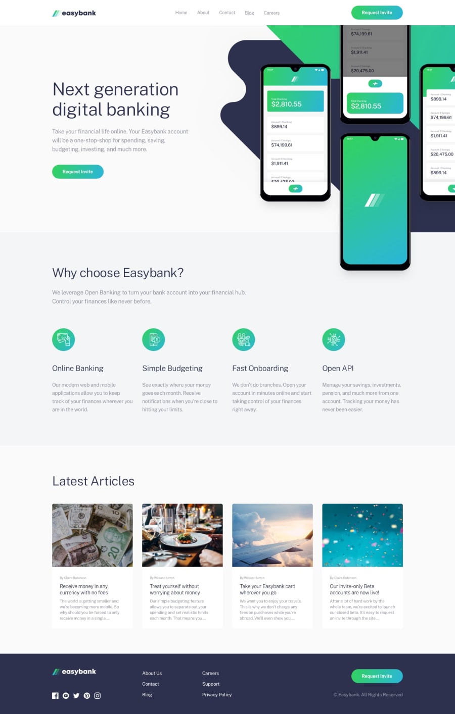
Responsive landing page using grid and flexbox mobile first approach
@erickamae-mateo
Design comparison
SolutionDesign
Solution retrospective
I would be glad if you could review my work. Please let me know if you have any comments. I'd appreciate if I receive your feedback so that I can make any changes and improve my knowledge and skills.
Community feedback
- @tesla-ambassadorPosted about 3 years ago
Hey, I really like your solution and I really like the effect you applied on the images at the bottom. It's really awesome and super cool. I just have but a few issues to address;
- On the mobile screen width some elements are not properly aligned and therefore people using mobile phones won't be able to see your awesome work. (Next generation banking text and digital banking text)
- I think you should put the div containing attribute class in a landmark (section or article) so that you can avoid accessibility issues and help those people using screen readers. Otherwise, this is a pretty great solution. Kudos! Keep on coding!
0@erickamae-mateoPosted about 3 years ago@tesla-ambassador thank you for your feedback especially with the “accessibility issues”! Really appreciated 🙂
1
Please log in to post a comment
Log in with GitHubJoin our Discord community
Join thousands of Frontend Mentor community members taking the challenges, sharing resources, helping each other, and chatting about all things front-end!
Join our Discord
