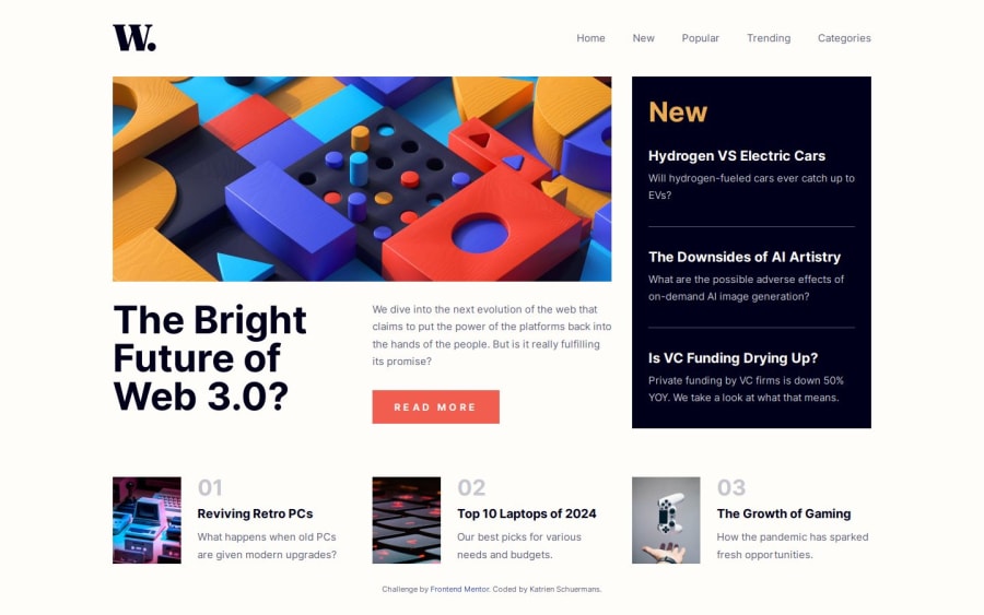
Responsive landing page using grid and flex.
Design comparison
Solution retrospective
I worked through the solution a lot different from how I usually tackle an exercise. It doesn't show probably, but I took a more step-by-step approach where I didn't loose oversight.
What challenges did you encounter, and how did you overcome them?I struggled placing the overlay and couldn't find the solution. I will look into this when I adapt my hamburger-menu.
What specific areas of your project would you like help with?I was feeling proud of my hamburger-menu but realised when I was about to add the A11Y-features, this solution is not that user-friendly. I'll look into how making a better and accessible hamburger-menu.
Feel free to guide me to good resources on A11Y.
Community feedback
Please log in to post a comment
Log in with GitHubJoin our Discord community
Join thousands of Frontend Mentor community members taking the challenges, sharing resources, helping each other, and chatting about all things front-end!
Join our Discord
