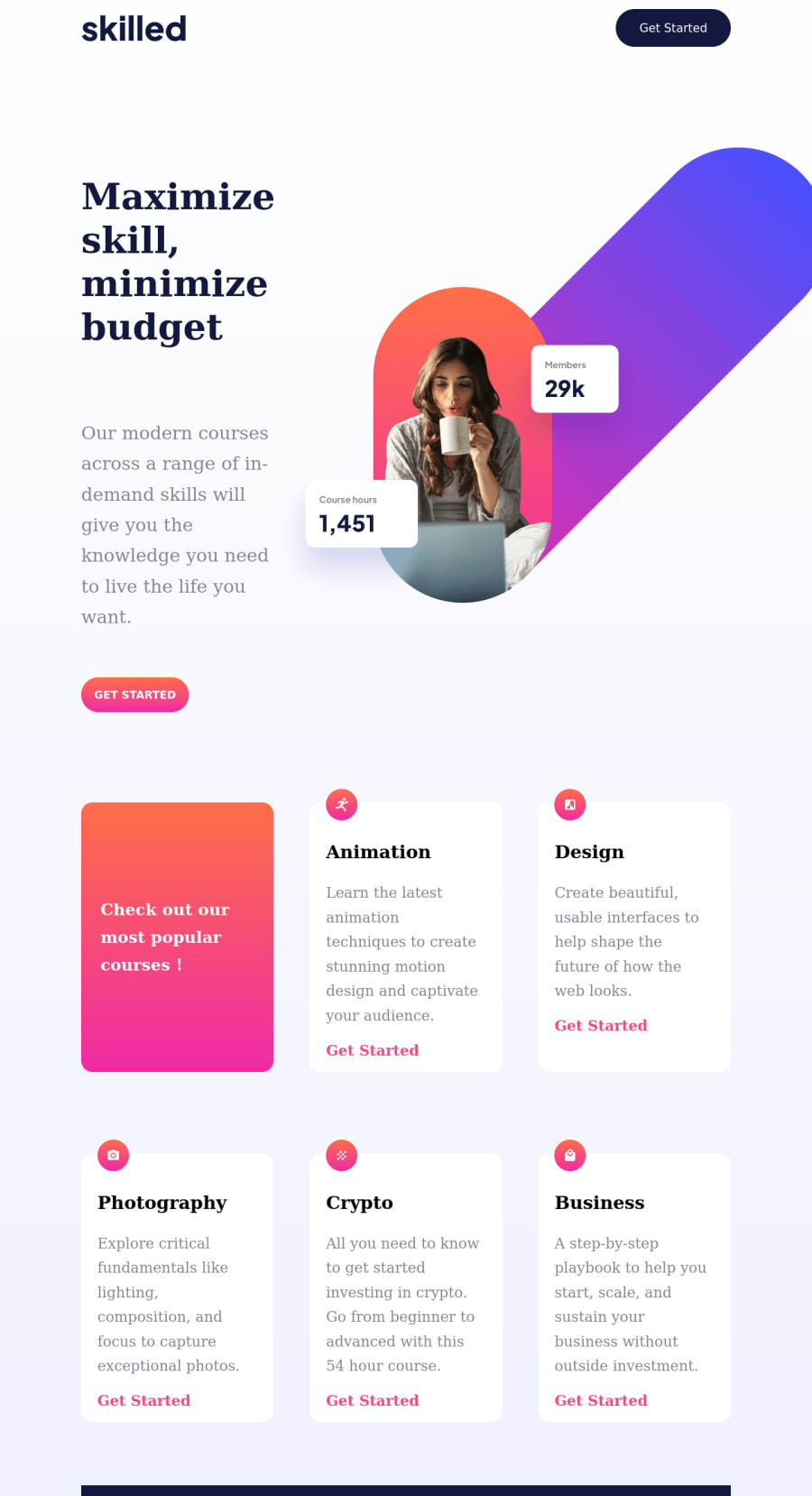
Design comparison
Solution retrospective
- the responsive images were issue
- started w mobile first. Mistake! here u have to start w desktop version
Community feedback
- @ChamuMutezvaPosted over 2 years ago
Greetings Vlastimil Slechta, Congratulations for taking your first challenge. Here are a few recommendation from my end
HTML Structure
- the
get started
buttons, all of them should have been anchor elements. This challenge in my opinions does not need a form as well.Get started
should be linking you to another section or page that will help you to get started. - for the
minisection
images, you have given all the images thealt
value ofrunning man
. I think you may have forgotten to change them.
CSS
- The
body
should not be restricted in size, it would be best to have an element such as a div that can act as a wrapper inside the body. - starting mobile first is the recommended way, so i would not say, it is a mistake. Rather you need to keep on practicing.
- the site needs improvement on responsive .
I have completed this challenge , using react - but if you want to look at the layout , here is the link solution
I would suggest to look as single component challenges like the
QR code component
, it will give you more room to practice centering the site.Marked as helpful1@valCechPosted over 2 years agoHallo @ChamuMutezva , thank you very much for your feedback.
HTML I did try to create buttons with anchor but W3C validator was showing warning that no anchor can be inside a button. Therefore I had had to use the form. I couldnt find any other solution. Would love to hear of any other...
The running man imgs yeah I forgot to change it, newbie mistake
CSS I did restricted the body size thinking if it goes from side to side it doesnt look too nice and its too big. Or at least on my screen...
The mobile first issue, I know I should do as you say but I had one column than make it two and then even three when u have to take off one column of the prevoius structer and add it to make 3..... I found it impossible due to div structer
What improvement on responsive you meant? I d love to hear it and try to fix it to make it perfect.
To build this site w React as u did sounds a bit sci-fi for me, haha. I did finish JavaScript but I am still not sure w many things and therefore I gave up to learn React. Instead I am focusing to perfect JS.
I am going to do the single component as you recommended, the QR code.
Thank you very much for your time, Vlastimil :)
0 - the
Please log in to post a comment
Log in with GitHubJoin our Discord community
Join thousands of Frontend Mentor community members taking the challenges, sharing resources, helping each other, and chatting about all things front-end!
Join our Discord