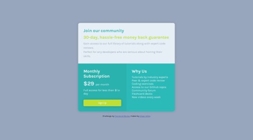
Design comparison
Solution retrospective
Started by analyzing the landing page, so i created first three div.'s after after that I gave the first div a span of 2 so it could occupy two spaces.
Community feedback
- @Bishalsnghd07Posted 9 months ago
Hi, @Vilzani
Great work👏 and congrats for completing this challenge🎉
I like your approach, but I would recommend one thing, you used br tag many times in your bottom right paragraph right? Why use br tag many times? Why increasing the number of code? Why you using HTML for make separate lines for your paragraph? Just by using CSS property
max-width
in that paragraph, and you can easily separate your paragraph in next line, just by using only single time max-width instead of using again and again of<br>
. By doing that you can improve the performance of your web page.And one more thing, there is an tool, that is called lighthouse that will test your performance of your web page, accessibility, best practices, SEO and many more. What you have to do is, just inspect in your web page, in which you are currently working and after inspecting you will see a many option and one of them option you will be there is lighthouse, just click on it and test your web page run time performance and many more to check the smoothness of your web page. It's a great tool and helps me to identify my web page issues, bugs and it enhance the efficiency of my web page.
Hope this suggestion would be helpful❤️
Once, again Welcome to Frontend Mentor.
Marked as helpful0@VilzaniPosted 9 months agoHello @Bishalsnghd07,
Thanks a lot for your Feedback. I'll take that to account and use these tips on other challenges to make it easier and use less code!
Best regards, Vilzan
1
Please log in to post a comment
Log in with GitHubJoin our Discord community
Join thousands of Frontend Mentor community members taking the challenges, sharing resources, helping each other, and chatting about all things front-end!
Join our Discord