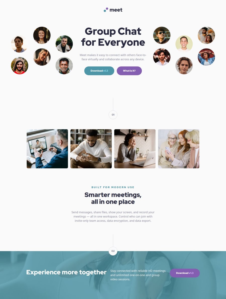
Responsive landing page using FlexBox/Grid


Design comparison

Solution retrospective
I'm proud of the way I decided to fully commit on mobile first. I'm also porud of my use of media queries combined with flexbox/grid layout.
What challenges did you encounter, and how did you overcome them?I encountered challenges in order to separate which CSS had to go in which class. I tried to keep generic and specific css separated in order to make easily reusable.
What specific areas of your project would you like help with?I'd like help with the use of @use instead of @import. If you got some improvements on images management, don't hesitate also :)
Community feedback
- P@i-prkrPosted 7 months ago
This is a great solution!! I enjoyed looking at it and it looks very good.
I am not familiar with Vue projects yet so I am not sure what to suggest, but it appears as though
<header-content>images are not changing for smaller devices and is still showing the 'left' and 'right' images meant for desktop. I can see in Vue.app where the isDesktop() function is being used to change the image but it might not be working correctly? I've tried it on chrome and firefox.Also with regards to using
@useand@forwardfor sass, I found a video on youtube really helpful, by Kevin Powell. https://www.youtube.com/watch?v=CR-a8upNjJ0Great solution!
Marked as helpful0@JamesLavironPosted 7 months ago@i-prkr Thanks a lot for your comment :) Very helpful, I'll look at the video. For Vue device detection, it seems like it's called only one time so window resize won't work using this technique. But I assume ppl won't resize it after page has been called
0@JamesLavironPosted 7 months ago@i-prkr The video you sent me is very clear!! Thanks a lot mate :)
0P@i-prkrPosted 7 months ago@JamesLaviron Ah I understand, that makes sense.
Great I'm happy that it was helpful!! :)
0

Please log in to post a comment
Log in with GitHub
Join our Discord community
Join thousands of Frontend Mentor community members taking the challenges, sharing resources, helping each other, and chatting about all things front-end!
Join our Discord