Design comparison
SolutionDesign
Community feedback
- @GiovanniEstradaPosted about 2 years ago
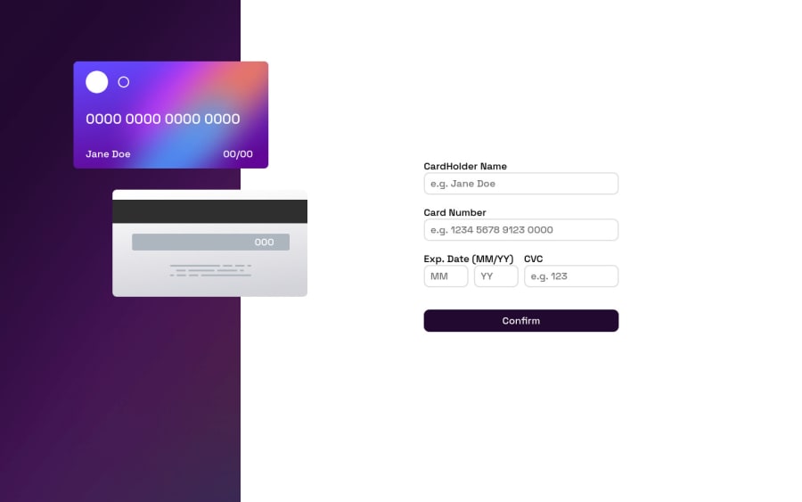
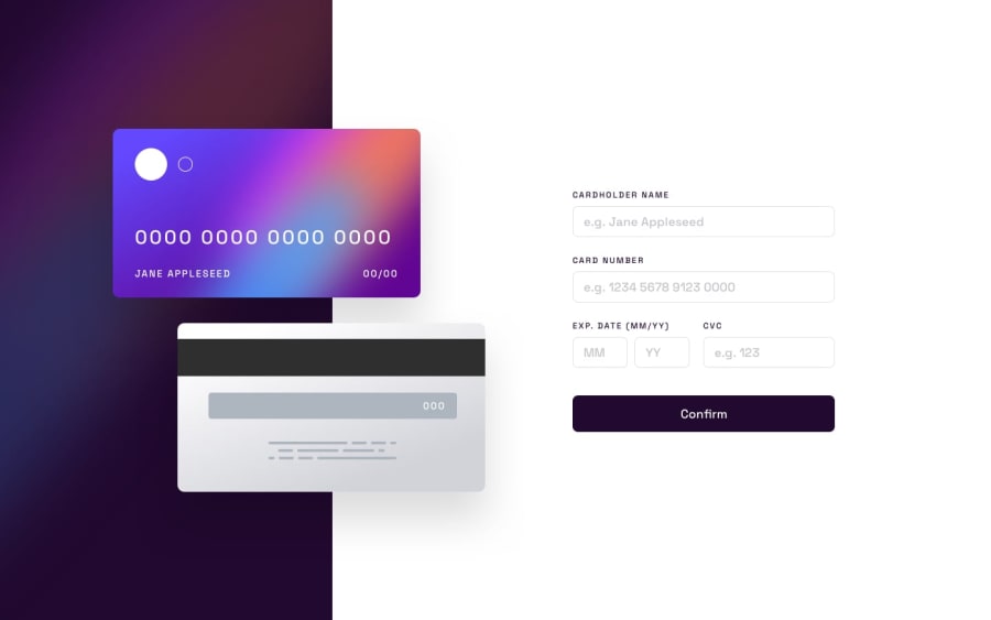
You have an amazing work, only I think the cards should be more smaller. Another tip is to try to put the overflow-x of the body in hidden to avoid problems with different resolutions. Congratulations
Marked as helpful0
Please log in to post a comment
Log in with GitHubJoin our Discord community
Join thousands of Frontend Mentor community members taking the challenges, sharing resources, helping each other, and chatting about all things front-end!
Join our Discord
