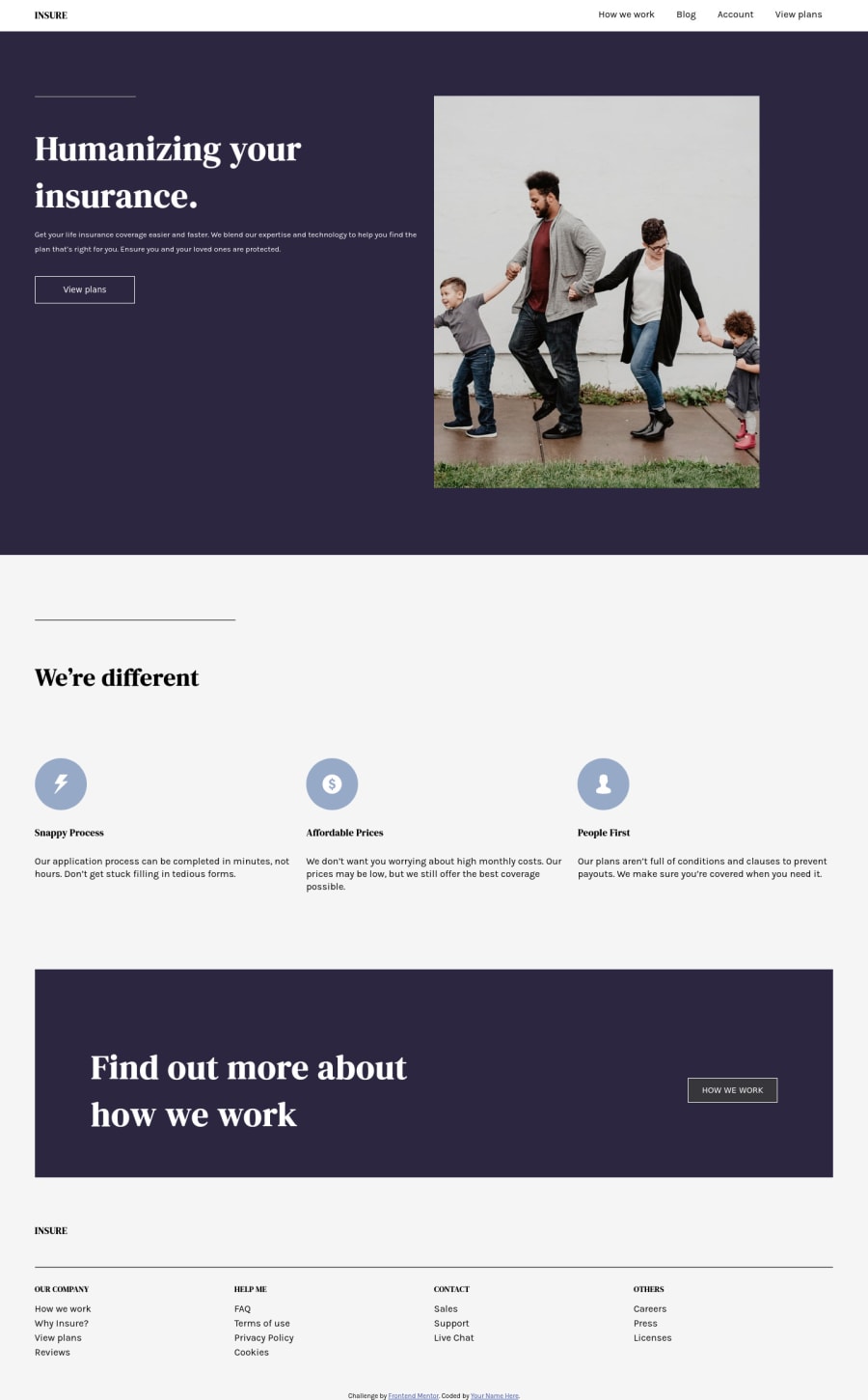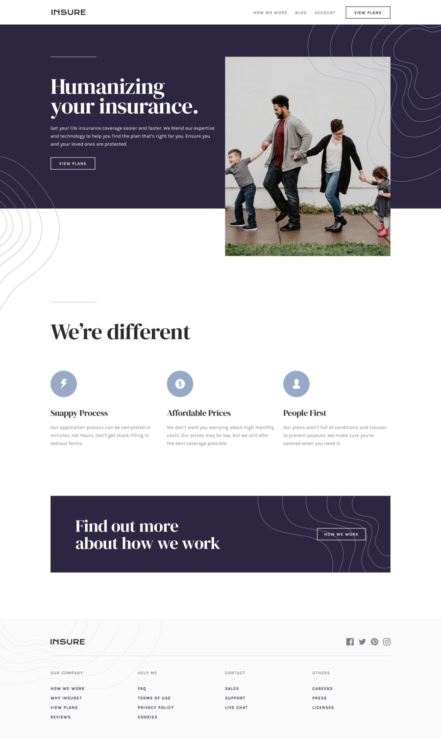
Design comparison
Solution retrospective
New to Front-End Development. Open to feedback.
Community feedback
- @RMK-creativePosted over 3 years ago
Hi QWen, congrats on having a go at this one! It does look a bit unfinished, but I do commend you for your bravery!! It's quite a challenging one for people new to web dev, so kudos to you
I would recommend going through the html and accessibility report - there are some issues with headings not being in ascending order, and being placed where they shouldn't be (e.g in ul). The reports have useful links so you can learn more about these points.
Compared to the design, things look to be in the right place, but spacing and font sizes could be improved to get it a little closer. For example, in the We're Different section, max-width and increased font-size on the sub-headings will make it much more readable.
Keep going with it, and ask questions in the slack help channel if you get stuck or need assistance.
Marked as helpful0 - @qingwen-kbPosted over 3 years ago
Really encouraging to receive feedback. Thank you for your time.
0
Please log in to post a comment
Log in with GitHubJoin our Discord community
Join thousands of Frontend Mentor community members taking the challenges, sharing resources, helping each other, and chatting about all things front-end!
Join our Discord
