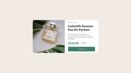
Not Found
Not Found
Not Found
Not Found
Not Found
Not Found
Not Found
Not Found
Not Found
Not Found
Not Found
Not Found
Not Found
Not Found
Not Found
Not Found
Not Found
Not Found
Not Found
Not Found

Submitted

Responsive landing page using flexBox

P

@Godinhoweverson

Desktop design screenshot for the Product preview card component coding challenge

This is a solution for...

  • HTML
  • CSS
1newbie
View challenge

Design comparison


SolutionDesign

Solution retrospective


What are you most proud of, and what would you do differently next time?

I'm most proud of my work with CSS Flexbox. Next time, I will organize the CSS into separate folders to improve readability and add more comments in both the HTML and CSS sections.

Community feedback

Daniel šŸ›øā€¢ 44,230

@danielmrz-dev

Posted

Hello there!

Congrats on completing the challenge! āœ…

Your project looks great!

I have a suggestion about your code that might interest you:

šŸ“Œ You can use the <picture> tag when you have different versions of the same image.

Using the <picture> tag will help load the correct image to the user's device, saving bandwidth and improving performance.

Example:

<picture>
    <source media="(min-width: 768px)" srcset="{desktop image path here}">
    <img src="{mobile image path here}" alt="{alternative text here}">
</picture>

I hope this helps!

Other than that, excellent work!

0
Roselin Yā€¢ 330

@Vanillatte68

Posted

Good job!

I recommend to use pixels, em/rem as measurement units to set the width and height of the container so the content inside it won't overflow when being viewed in different display.

0

Please log in to post a comment

Log in with GitHub
Discord logo

Join our Discord community

Join thousands of Frontend Mentor community members taking the challenges, sharing resources, helping each other, and chatting about all things front-end!

Join our Discord