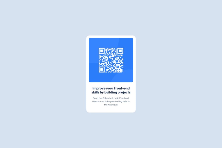
Responsive landing page using Flexbox, SCSS and BEM methodology
Design comparison
Community feedback
- @MikDra1Posted about 2 months ago
Well done, here are some things to review 😊:
-
Overusing div tags: Try using more semantic HTML elements like
<section>,<header>, and<article>. It’ll help with both accessibility and SEO. -
Neglecting responsive design: Make sure you're using media queries and following a mobile-first approach so your site looks great on all devices.
-
Inconsistent class naming: It’s easy to end up with a mess of class names. Consider using a system like BEM for better organization and scalability.
-
Using px for everything: Instead of
pxfor fonts and layouts, try using relative units likeremoremto make your design more adaptable to different screen sizes. -
Forgetting alt text on images: Don’t skip the
altattribute. It’s essential for accessibility and helps search engines understand what your images are. -
Poor use of Flexbox and Grid: Be careful not to mix Flexbox and Grid unnecessarily. Each has its strengths—use the right one based on the layout needs.
-
Not testing across browsers: Don’t forget to check how your site looks in different browsers like Firefox and Safari. Cross-browser testing is super important.
-
Ignoring accessibility: Focus on features like keyboard navigation, contrast ratios, and ARIA labels. They make your site usable for more people.
-
Using fixed heights for elements: Setting fixed heights can cause overflow issues. Use
min-heightor allow content to expand naturally to avoid problems. -
Not using responsive images: Be sure to use
srcsetor the<picture>element to optimize images for different devices. This improves performance, especially on mobile.
Hope you found this comment helpful 💗💗💗
Good job and keep going 😁😊😉
Marked as helpful0 -
Please log in to post a comment
Log in with GitHubJoin our Discord community
Join thousands of Frontend Mentor community members taking the challenges, sharing resources, helping each other, and chatting about all things front-end!
Join our Discord
