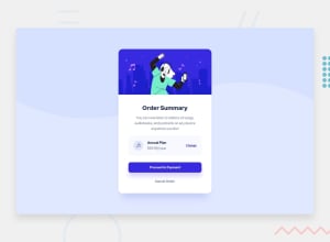
Design comparison
Community feedback
- @SuhodolecAPosted almost 3 years ago
Hello! Beautiful work! With a few changes, you could improve your solution.
1)You have a little gap between "main-picture" and "container". You can fix this using:
.main-picture { display: block; or vertical-align: middle; }
- The main section has the wrong background color. Fix:
main { background-color: white; max-width: 400px; border-radius: 1rem 1rem 0 0; }
- plan-info section, use the following properties to fix some differences between design and your solution: "border-radius", "padding", remove "justify-content: space-around" this property For example:
.plan-info { display: flex; align-items: center; width: 100%; background-color: var(--VeryPaleBlue); margin: 2rem; border-radius: 10px; padding: 10px; }
10px values it's approximate because i don't have that layout now, use correct values.
Next, .plan-info img use here margin-right For example:
plan-info img { justify-content: flex-start; max-width: 100%; margin-right: 10px; } 10px values it's approximate because i don't have that layout now, use correct values.
And for plan-info a use "mragin-left: auto"
.plan-info a { color: var(--BrightBlue); font-weight: 500; margin-left: auto; } After these fixes, in my opinion, your solution will be exactly the same as the layout!
Good luck!
Marked as helpful1 - @ThiagovascPosted almost 3 years ago
Thx for the feedback I will follow your tips
0
Please log in to post a comment
Log in with GitHubJoin our Discord community
Join thousands of Frontend Mentor community members taking the challenges, sharing resources, helping each other, and chatting about all things front-end!
Join our Discord
