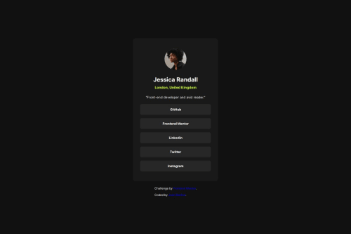
Not Found
Not Found
Not Found
Not Found
Not Found
Not Found
Not Found
Not Found
Not Found
Not Found
Not Found
Not Found
Not Found
Not Found
Not Found
Not Found
Not Found
Not Found
Not Found
Not Found

Submitted

Responsive landing page using flexbox

@JuanBachurDEV

Desktop design screenshot for the Social links profile coding challenge

This is a solution for...

  • HTML
  • CSS
1newbie
View challenge

Design comparison


SolutionDesign

Solution retrospective


What are you most proud of, and what would you do differently next time?

The exercise looks like very similar about the example of the frontend mentor page. In the next exercise I would like write with em and rem units in CSS, I think that way is the correct form to establish or write a good code.

What challenges did you encounter, and how did you overcome them?

I could centralized the card in the middle of the DOM. Previously in the last exercise I could'n because I didn't notice how to made it.

What specific areas of your project would you like help with?

I need some suggest about how to write with em and rem units in css.

Community feedback

Levi 90

@law973

Posted

Hey there! I like the way your solution turned out visually.

Regarding the usage of rem units, there's a great article called "The Surprising Truth About Pixels and Accessibility" that I found helpful: https://www.joshwcomeau.com/css/surprising-truth-about-pixels-and-accessibility/

One other thing: the deep blue color of the links in the attribution section makes them a little hard to read when they have a dark background behind them; choosing the right colors to create enough contrast between pieces of text and their backgrounds is important. There's a tool called a Contrast Checker that's really handy in this regard: https://webaim.org/resources/contrastchecker/

Hope this helps!

0
P
Steven Stroud 4,140

@Stroudy

Posted

 <div class="card-social-link">
     <a href="https://github.com/JuanBachurDEV" target="_blank"><p>GitHub</p></a>
 </div>
  • The code isn't semantically correct because a block-level <p> tag is inside an inline <a> tag. Instead, place text directly within the <a> tag or use a <span> for styling, ensuring proper HTML semantics and accessibility.

  • Using max-width: 100% or min-width: 100% is more responsive than just width: 100% because they allow elements to adjust better to different screen sizes. To learn more, check out this article: responsive-meaning.

  • Developers should avoid using pixels (px) because they are a fixed size and don't scale well on different devices. Instead, use rem or em, which are relative units that adjust based on user settings, making your design more flexible, responsive, and accessible. For more information check out this, Why font-size must NEVER be in pixels or this video by Kevin Powell CSS em and rem explained.- Another great resource for px to rem converter.

  • Using a full modern CSS reset is beneficial because it removes default browser styling, creating a consistent starting point for your design across all browsers. It helps avoid unexpected layout issues and makes your styles more predictable, ensuring a uniform appearance on different devices and platforms, check out this site for a Full modern reset

You’re doing fantastic! I hope these tips help you as you continue your coding journey. Stay curious and keep experimenting—every challenge is an opportunity to learn. Have fun, and keep coding with confidence! 🌟

0

Please log in to post a comment

Log in with GitHub
Discord logo

Join our Discord community

Join thousands of Frontend Mentor community members taking the challenges, sharing resources, helping each other, and chatting about all things front-end!

Join our Discord