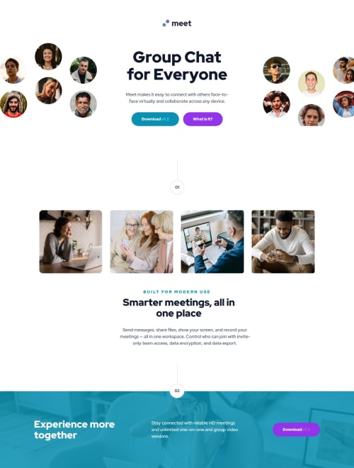
Submitted about 1 year agoA solution to the Meet landing page challenge
Responsive landing page using flexbox, grid and positioning
@NikitaVologdin

Solution retrospective
What are you most proud of, and what would you do differently next time?
Next when i will be getting text style from figma to make them sass mixins i am going to use those for global selectors. I notticed that designers they are using almost same styles for text elements like p, h1, h2. It is going to take less coding for media queries.
What challenges did you encounter, and how did you overcome them?There were a bit wrong files in startup folder so i exported right ones from figma design.
Code
Loading...
Please log in to post a comment
Log in with GitHubCommunity feedback
No feedback yet. Be the first to give feedback on Nikita Vologdin's solution.
Join our Discord community
Join thousands of Frontend Mentor community members taking the challenges, sharing resources, helping each other, and chatting about all things front-end!
Join our Discord