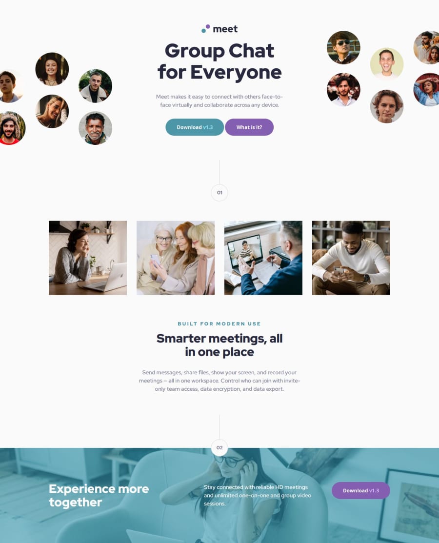
Design comparison
Solution retrospective
It took more time than expected but I did it anyway. The small details made me lose my mind in this one but overall it looks good and I am proud of it. Next time I would like to make seperate stylesheets and make codes more understandable. Also, I would start designing with the mobile screen first and go for desktop screen.
What challenges did you encounter, and how did you overcome them?I encountered lot of challenges during the process:
- I was not able to outflow the image out the border.
- When I started working for small screen the page started taking margin right for no reason.
- From figma, it made me confused about the padding and margin for the hero content and images.
I overcame them by adding all tiny details using figma. I used chatgpt to help me figure out why the screen was moving right.
What specific areas of your project would you like help with?I would like help with managing the codes properly. My CSS looks so exhausting and is not that clear to read. Also, I would like someone to suggest me which frameworks to use for the better design. Thanks
Community feedback
Please log in to post a comment
Log in with GitHubJoin our Discord community
Join thousands of Frontend Mentor community members taking the challenges, sharing resources, helping each other, and chatting about all things front-end!
Join our Discord
