Not Found
Not Found
Not Found
Not Found
Not Found
Not Found
Not Found
Not Found
Not Found
Not Found
Not Found
Not Found
Not Found
Not Found
Not Found
Not Found
Not Found
Not Found
Not Found
Not Found

Submitted

Responsive Landing page using flexbox

Nathasha 150

@NathashaR1997


Design comparison


SolutionDesign

Solution retrospective


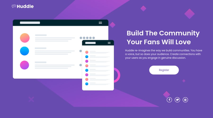
Hey Everyone, I have completed the challenge using flexbox.

Check out my following article, where I have briefly explained the steps I have followed to complete this challenge.

https://levelup.gitconnected.com/challenge-003-huddle-landing-page-with-a-single-introductory-section-6301c1bf30c3

Thank you for checking this out, and feel free to leave your feedback and thoughts!! Any feedback and tips are welcome.

Many Thanks! Nathasha 😊

Community feedback

T
ApplePieGiraffe 30,545

@ApplePieGiraffe

Posted

Hello, Nathasha! 👋

I'm very impressed with the effort that you put into writing that article on how you completed this challenge! It's incredibly detailed and informative! 🙌

I noticed, however, that you shared the design files for this challenge in the article, which is against our usage policy (since those design files are premium files for PRO members only). We kindly ask that you take those down and only share the screenshots of the design (such as the JPGs provided in the starter files). 🙂

Otherwise, you've done a great job on the challenge itself, as well! A few suggestions I have are,

  • Adding favicon to the site. There should be one in the free starter files for this challenge that you can use.
  • Adding min-height: 100vh to the body to ensure that the page is always at least as high as the viewport (and there is no empty space beneath the content of the page).
  • Setting the `alt` text for the image to an empty string so that it will be ignored by assistive technologies (since it isn't very important to the content of the page and doesn't need to be read by screen readers).
  • Adding some screen reader-only text to the social media links or adding an `aria-label` attribute to them instead to make sure they can be identified by screen readers.
  • Specifying values such as `margin`, `padding`, `font-size`, and more in a responsive unit such as `em` or `rem` (not `px`, which is a fixed unit), to ensure that changing the font-size of the document causes the rest of the site to scale up/down (which is important for accessibility reasons). To learn more about `em` and `rem`, see this.

Hope you find these suggestions helpful. 😊

Keep coding (and happy coding, too)! 😁

1

@nickfwilliams

Posted

Hi Nathasha! This looks great, very similar to the final design. The major thing I noticed that looked out of place is your background image. It's currently too small for larger screens - the issue here seems to be that you've applied the url to the container div, rather than the background. Try swapping it over and see what happens. All the best!

0

Please log in to post a comment

Log in with GitHub
Discord logo

Join our Discord community

Join thousands of Frontend Mentor community members taking the challenges, sharing resources, helping each other, and chatting about all things front-end!

Join our Discord