Responsive landing page using Flexbox and javascript
Design comparison
Solution retrospective
I began this challenge months ago, only returning recently to complete it. That said, there are many classes in the html that I did not use and forget to clean-up before submitting.
Any feedback or advice will be greatly appreciated.
Being a true beginner, I especially had difficulties with the javascript part of the code. Namely, in order to open/close each of the sub-menus within the navigation, I wrote individual functions for each of the icons. I am absolutely certain I could have reused the same function by utilizing the event target, but it is lost on me as to how to achieve this. Any direction to this end will be received with great gratitude.
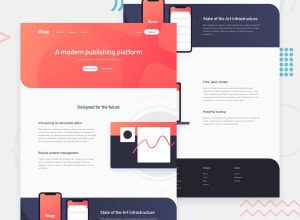
Positioning of the phones-image in the Infrastructure section proved difficult as it constantly moves as the width of the window increases/decreases. I positioned with a negative margin of the info div, but I expect there is an excellent javascript function for doing this more effectively...I would love to know the best way to handle this situation. I also had difficulty, in this same section, applying the linear gradient. It was cutting off part of the div and I am still at a loss as to why.
Again, any advice will be greatly appreciated. Thanks in advance!
Community feedback
- @DavidEmad01Posted almost 3 years ago
Good Job
Just Keep Coding until you reach your goal;
For HTML: Use alt for images and must not be empty.
Marked as helpful0 - @buneeIsSloPosted almost 3 years ago
Hey! @stephaniequintana, Good job on the challenge. To answer your questions...
-
Yes
event.targetis the right way to go about it. You would want to use theulandlitags to find out which nav element was clicked. I made a JS fiddle for you to test it out. -
Positioning elements is a hard thing to grasp, the only way to get better at it is by practicing. I'd say look into
absoluteandrelativepositioning -
The linear gradient part has me scratching my head too. but, a work around for this would be to set the
backgroundas the linear gradient and to position the circle image using:afterand:beforepseudo elements.
Hope this helps :)
Marked as helpful0@stephaniequintanaPosted almost 3 years ago@buneeIsSlo Thank you sooooo much! The JS fiddle was just what I was looking for. I needed a concrete example of the syntax in formula form. I've just never used event.target and, a bit embarrassingly, I had already put so much time into this challenge that I hoped directly asking would be more efficient that searching the web.
Beyond that, your recommendation for the gradient is so helpful. I forget how useful :before and :after can be and I'm definitely going to play around with that.
This is only the second challenge I've submitted, but I'm considering paying for the pro subscription so that I can get better challenges and see the solutions. Thank you, again!
Stephanie
1@buneeIsSloPosted almost 3 years ago@stephaniequintana Don't worry about it. You should join FEMs slack channel. There are plenty of people who'd be willing to help you with any of your problems.
I was going through your html code and noticed that you linked your
scriptbefore the<body>. This worked fine on the current challenge but, ideally you'd want to link yourscriptafter the<body>.I'm glad I could help, Keep Coding!
0 -
- @stephaniequintanaPosted almost 3 years ago
Sweet. Thank you! One of my pet peeves in all the tutorials I'm coming across is that they seem to leave out accessibility and will even go so far as to code inaccessible checkboxes to open/close menus...aaaaaaannndd then I forget the alt attributes. Thanks, again - I'll be sure to make it a priority!
--Stephanie
0
Please log in to post a comment
Log in with GitHubJoin our Discord community
Join thousands of Frontend Mentor community members taking the challenges, sharing resources, helping each other, and chatting about all things front-end!
Join our Discord
