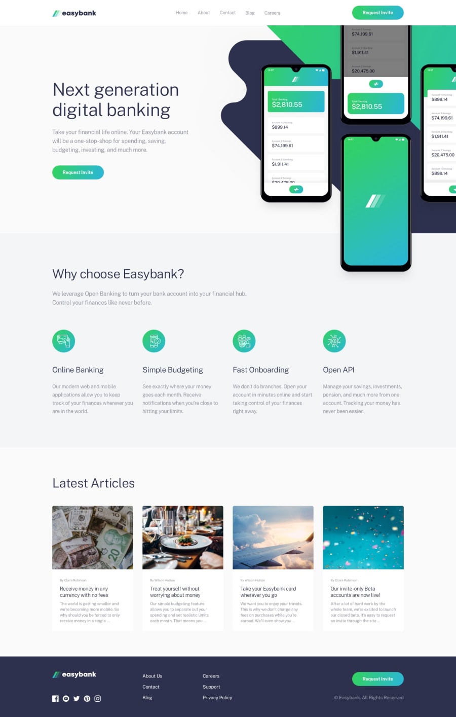
Responsive landing page using Flexbox and Grid & utilizing SCSS
Design comparison
Solution retrospective
My goal in this project is to utilize SASS and BEM approach to create a cleaner and efficient code. I am happy to hear your feedback to help me organize my code more and see a different approach in using CSS.
Community feedback
- @pikapikamartPosted about 3 years ago
Hey, really great work on this one. Layout in desktop looks really good, responds good and the mobile layout is good as well.
I don't have any suggestion for scss because we all have different approach on it. I also use bem and it is really good. But if there were, if you find reusing a lot of same stylings, use
@extendand create a extension class with%so that it won't be compiled. I personally use@extendthan@mixinsince@mixincompiles the same css for the selector which is bad since it just duplicates it.Some other suggestions would be:
- The website logo link should not be inside the
navelement, since it is not really a navigational link. - The website logo
atag should havearia-label="homepage"so that users will know where this link would take them. - The five primary links in the
headerare the ones that needs to be inside thenavelement. Also they should be insideulelement. Usingulelement on it would make it great, because screen reader will announce how many links or items are there inside theulelement. - Always have a
mainelement that will wrap the whole main content. A typical structure would look like:
<header /> <main /> <footer />- On the article section, each card should be inside a
articlesince those are articles right, better use it.
FOOTER
- Website logo
atag should havearia-label="homepage"as well. - The social media links should have been inside a
ulsince those are still list of links. - Other 6 links should be inside
navelement and are insideulelement. Those are the navigation list of links of the website.
MOBILE
- The hamburger menu should be using
buttonelement and notatag, since it is not really a link, it is a control for the dropdown. - Hamburger menu
buttonshould havearia-label="menu dropdown toggler"on it, so that users will know what thisbuttondoes. - The
buttonas well should havearia-expandedon it being changed by javascript, if the dropdown as appeared or not.
Aside from those, great work on this one.
Marked as helpful0@jlpastoPosted about 3 years agoHi @pikamart Thank you for your detailed feedback. It is really helpful, i I was blown away to be honest after realizing I had overlook so many things. Rest assured that I will going to update my website and correct my code. Thanks again and looking forward to get your feedback to my future projects. Tia
1 - The website logo link should not be inside the
Please log in to post a comment
Log in with GitHubJoin our Discord community
Join thousands of Frontend Mentor community members taking the challenges, sharing resources, helping each other, and chatting about all things front-end!
Join our Discord
