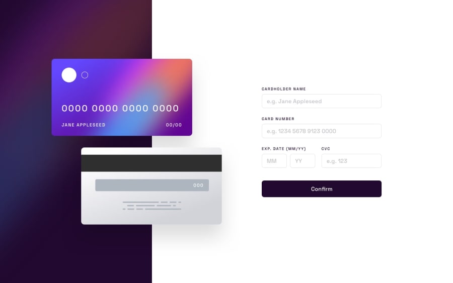
Design comparison
Solution retrospective
-
Which parts of the project do you think could be improved and why?
-
How well does the project respond to different screen sizes and devices? Are there any areas that could be improved for better responsiveness?
-
Is the code easy to read and understand? Are there any areas where I could improve code readability or use more meaningful variable/function names?
-
I am keen on learning more about frontend development best practices. Did you identify any aspects where I could improve in this regard?
Community feedback
- @raubacaPosted 10 months ago
Hi Clara,
One thing you can improve is to change the card number
inputtype from "text" to "number" and hide the input arrows with CSS. You can also set amin="0"attribute to the input so people don't input negative numbers.Good job!
Marked as helpful0@clarabackerPosted 10 months agoHi Rau,
I wanted to express my gratitude for your feedback – it means a lot! Your suggestion to change the input type from card number to “number” and hide the arrows with CSS is a great idea to improve user experience. I opted for "text" to align with the project's allowance for alphanumeric input, but I'll definitely keep your recommendation in mind for future projects or updates.
Thanks again for your thoughtful input! Feel free to share more thoughts – your input is always welcome!
1
Please log in to post a comment
Log in with GitHubJoin our Discord community
Join thousands of Frontend Mentor community members taking the challenges, sharing resources, helping each other, and chatting about all things front-end!
Join our Discord
