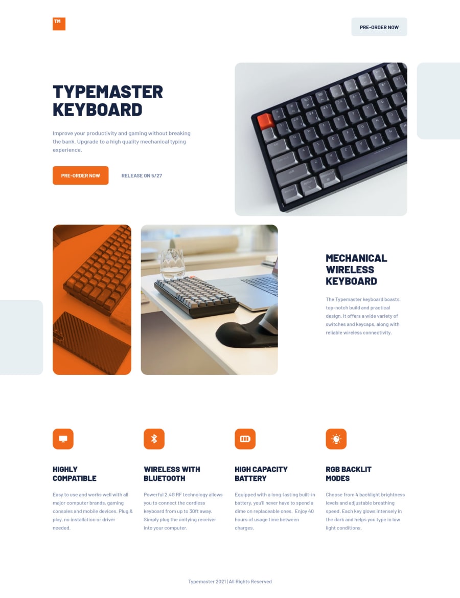
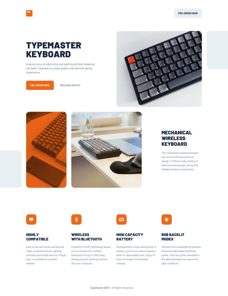
Responsive landing page using Flexbox and CSS Grid


Design comparison
Solution retrospective
Hey everyone! 🙋♂️
This was my first 'Junior' level challenge I have tried and I have to say it was a little difficult for me, mostly due to the multiple images and shapes a that are placed off-screen in different positions at different breakpoints. I'm wondering if I used the overflow property correctly to get this to work? Also, this is the first time I've used the <picture> element. Did I use it correctly and is this the best option when I want load different image sizes and different screen sizes? Lastly, I feel like I wrote too much code, both CSS and HTML. Is there any way I could have made my code more 'DRY'? Did I miss anything else?
Thank you for your feedback! 👍
Community feedback
Please log in to post a comment
Log in with GitHub
Join our Discord community
Join thousands of Frontend Mentor community members taking the challenges, sharing resources, helping each other, and chatting about all things front-end!
Join our Discord