


Design comparison


Solution retrospective
What are you most proud of, and what would you do differently next time?
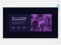
I am proud of the way I made the image look good in ''any'' proportions, and how I added a filter to it.
What challenges did you encounter, and how did you overcome them?
Making it collapse when the image and the main section overflows, I knew that flexbox lets you do this but I didn't really knew how to, so I had to look for information about flex: ; and how it worked, until i eventually tried it by myself and made it work.
What specific areas of your project would you like help with?
If you think I did anything wrong or got a suggestion to improve, feel free to tell me and I will totally take it in account for next projects.
Community feedback
Please log in to post a comment
Log in with GitHub
Join our Discord community
Join thousands of Frontend Mentor community members taking the challenges, sharing resources, helping each other, and chatting about all things front-end!
Join our Discord