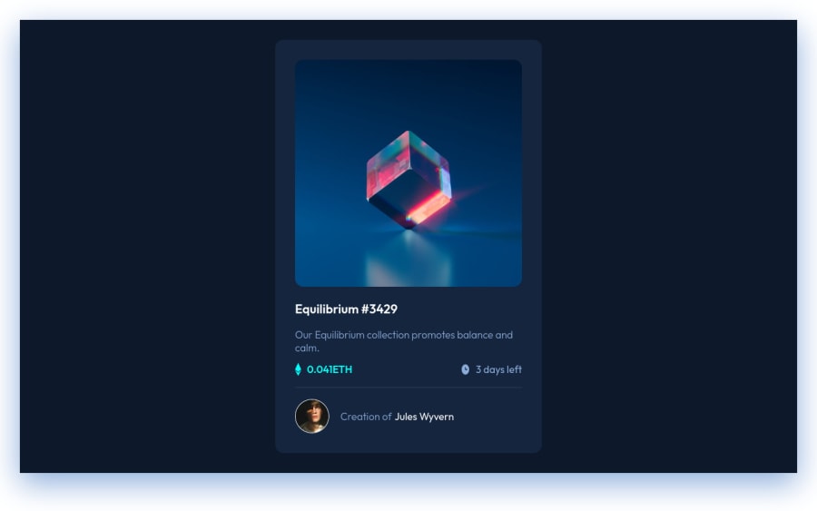
Design comparison
Solution retrospective
Hello, this is my first submit in FrontEndMentor. I didn't add a readme file because I don't know if it is necessary.
Community feedback
- @anoshaahmedPosted almost 3 years ago
To avoid accessibility issues in the future:
- wrap everything in your body in <main>
- have at least one h1 in your code
Good job! :)
Marked as helpful0 - @brodiewebdtPosted almost 3 years ago
You did a good job on the card. I have a couple of suggestions. Remove the header div, it isn't needed and can be removed. Put the background color on the body tag and add the following code to center the card in the viewport:
display: grid; place-items: center; min-height: 100vh;That will make a big difference.
Wrap your container div in a Main tag and change your H3 tag to an H1. Every page should have an H1 for accessibility reasons. You won't have to re-style it because you used the .card-name class. doing those things will clear the accessibility warnings. You also want to start using rem units for fonts and rems or em for margin and padding for responsive reasons. Pixels aren't responsive. You also forgot to add the hover states in the design.
Download AXE DevTools and you can clear accessibility warnings while you code. https://www.deque.com/axe/devtools/
Hope this helps.
Marked as helpful0
Please log in to post a comment
Log in with GitHubJoin our Discord community
Join thousands of Frontend Mentor community members taking the challenges, sharing resources, helping each other, and chatting about all things front-end!
Join our Discord
