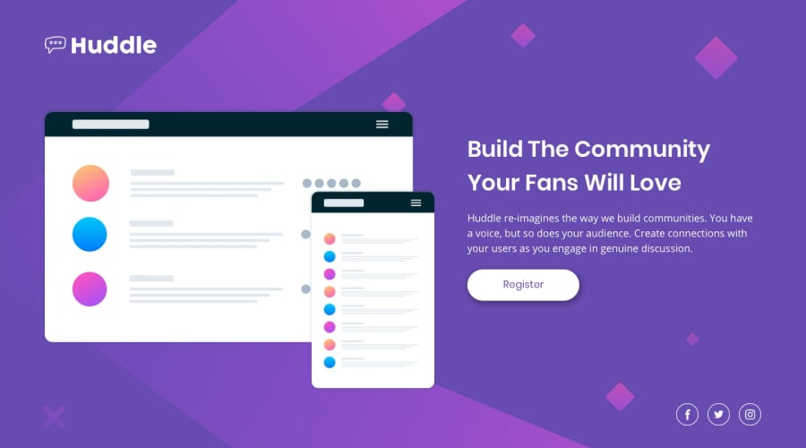
Design comparison
SolutionDesign
Solution retrospective
Feel free to comment and help me improve!
Community feedback
- @dgjenni2Posted about 2 years ago
- On the desktop view, I would increase the margins so the content is a little more centered.
- I don't like how the icons are positioned relative to the screen; it creates a weird effect where the buttons slide across the width of the text area and then exceed it depending on the sceensize. Could include them in the text container so they align with maximum size of the text content?
- You might want to readjust the media query width that transitions from mobile to desktop. There's a good 300ish pixel range from about 640-940 where all or some of the text gets pushed off screen. The mobile-first approach should technically allow you to use the mobile layout at any size, so if you change that width to change when the image and text fit on the screen, it would improve the layout dramatically in my opinion.
- You might want to add a max-width to the main content area for when displaying on extra large monitors.
Overall, I really like your submission. It's very clean. It makes good use of additional html5 elements besides divs. It also declares the color scheme in css variables. Good work. Just needs some finishing touches.
Marked as helpful0@VanessaAzPosted about 2 years ago@dgjenni2 thanks for all your suggestions, I will include them as soon as possible!
0
Please log in to post a comment
Log in with GitHubJoin our Discord community
Join thousands of Frontend Mentor community members taking the challenges, sharing resources, helping each other, and chatting about all things front-end!
Join our Discord
