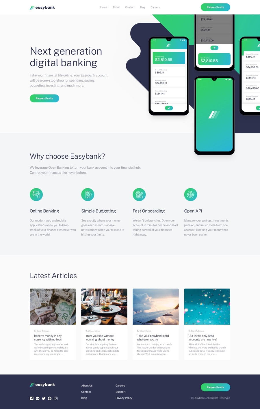
Design comparison
Solution retrospective
Any suggestions/criticisms on how I can improve are most welcome
Community feedback
- @mattstuddertPosted about 4 years ago
Hey Safa, I've not got much to say other than you've done an amazing job! The one area I'd say that could be improved is how you're using headings in your HTML.
At the moment, you've got
h1,h3,h4, andh6headings on this page, but noh2orh5. I'd recommend avoiding skipping heading levels unnecessarily. This can cause accessibility issues in the content hierarchy for screen reader users. You're also using ah6for the introductory paragraph ("Take your financial life online..."). This is a paragraph of text, not a heading, so aptag would be best here.Some re-working of the headings and this would be near perfect. Awesome work! 🙌
2@safrukPosted about 4 years agoThanks Matt!! It's always great to hear from you. I never knew that skipping heading levels is an issue and keep using
h6just out of habit. Will remember to keep this bit in mind henceforth. Thanks!!0@mattstuddertPosted about 4 years ago@safruk you're welcome! Here's a great article for more information about page structure with headings: https://www.w3.org/WAI/tutorials/page-structure/headings/.
1 - @Adegbulugbe-IsraelPosted about 4 years ago
Great job man!
1
Please log in to post a comment
Log in with GitHubJoin our Discord community
Join thousands of Frontend Mentor community members taking the challenges, sharing resources, helping each other, and chatting about all things front-end!
Join our Discord
