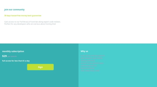
Design comparison
Solution retrospective
I am proud of that I finally used flex box reponsively . I would try the same page using react.js .
What challenges did you encounter, and how did you overcome them?Responsiveness was the major challenge
What specific areas of your project would you like help with?"I need help with the CSS part of my project, particularly focusing on making my layout responsive using flexbox. I'm struggling with ensuring that the elements adjust properly across different screen sizes and devices. Specifically, I want to optimize the responsiveness of my flexbox layout to ensure it works well on mobile devices. Any guidance or tips on achieving this would be greatly appreciated."
Community feedback
- @Bishalsnghd07Posted 8 months ago
Hi, @Riya922003๐
Congrats for completing this challenge๐
First, of all I will tell you, the name of this challenge is single price grid component. So, by seeing the name it is highlighting that this challenge is made for using grid instead of flex. My opinion is also same you should use grid, using flex will only create panic and nothing else or you have to work to hard. So, better option and approach is to use grid. If you know grid, then I would definitely recommend to use grid not flex. If you don't know then I will say please do learn the grid and applied it. Surely, you will get your result. Also, you can refer to any senior developer's here, who create this project, from them you will learn a lot and also you can see my solution also.
Hope, this small tip will help you with the approach.
Once again Welcome to Frontend Mentor wishing you a very joyful journey ahead and Happy Coding โค๏ธ
0 - @danielmrz-devPosted 8 months ago
Hey @Riya922003!
Your solution is really impressive!
I've got a couple of ideas (about how to use HTML better) that could make it even stronger:
๐ First: Think about using
<main>
to wrap your main content instead of<div>
.Imagine
<div>
and<span>
in HTML as basic containers. They're good for holding stuff, but they don't tell us much about what's inside or its purpose on the webpage.๐ Second: Don't skip heading levels โ start with
<h1>
, then use<h2>
, and so on.It's more than just text size โ it's about structuring your content effectively:
- The
<h1>
to<h6>
tags are used to define HTML headings. <h1>
is for the most important heading.<h6>
is for the least important heading.- Stick to just one
<h1>
per page โ it should be the main title for the whole page.
These tweaks might not change how your page looks, but they'll make your HTML code clearer and help with SEO and accessibility.
Hope that's helpful!
Keep up the great work!
0 - The
Please log in to post a comment
Log in with GitHubJoin our Discord community
Join thousands of Frontend Mentor community members taking the challenges, sharing resources, helping each other, and chatting about all things front-end!
Join our Discord