Submitted over 1 year ago
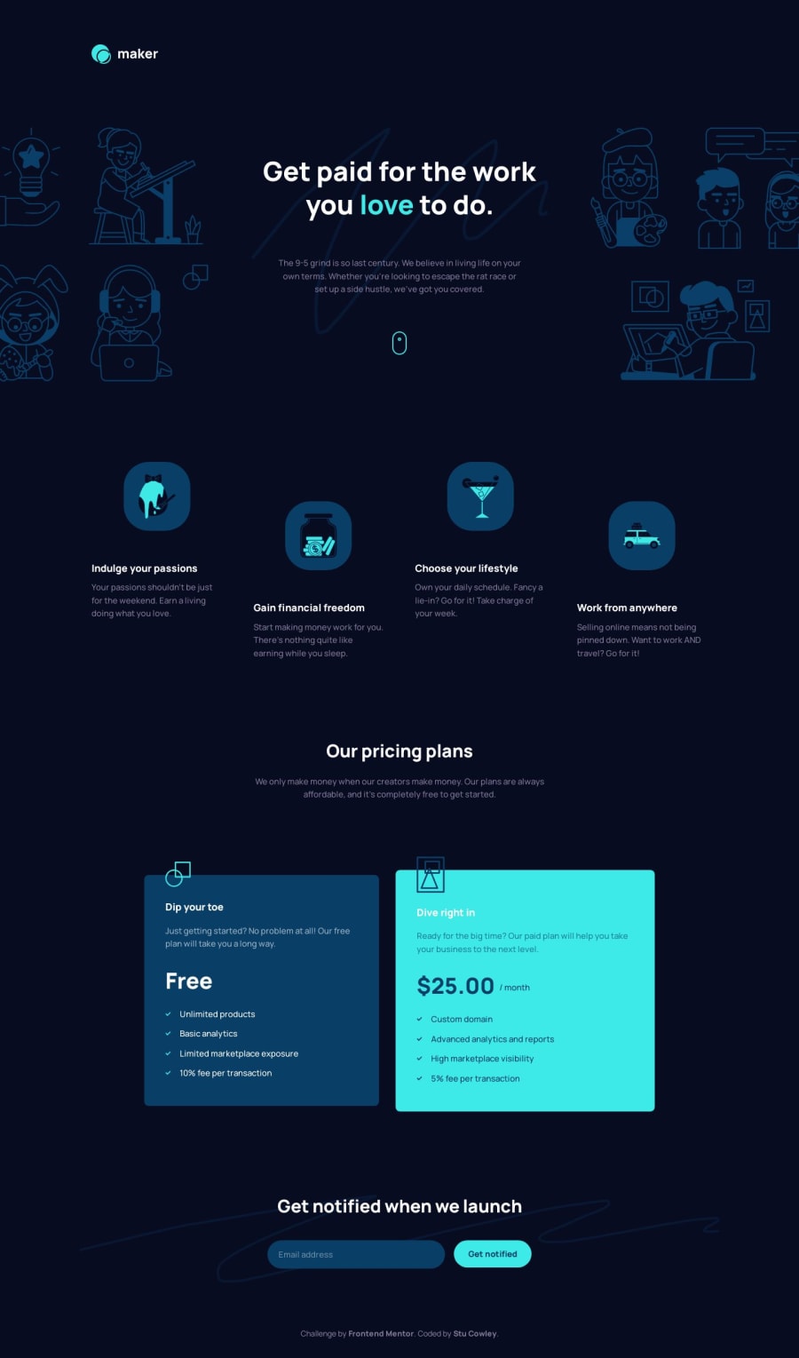
Responsive landing page using Flex and grid with email validation
@frontendstu
Design comparison
SolutionDesign
Solution retrospective
I had a great time building this solution. I found that it was enough to test myself, but not too much to break me. I was able to confidently build the layout and match the design as close as possible.
My only thing I wasn't able to get right was the squiggle on the email notfication section. But overall I thoroughly enjoyed this project.
Community feedback
Please log in to post a comment
Log in with GitHubJoin our Discord community
Join thousands of Frontend Mentor community members taking the challenges, sharing resources, helping each other, and chatting about all things front-end!
Join our Discord
