

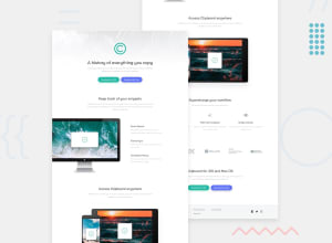
Design comparison

Community feedback
- @Ola-star-coderPosted 11 months ago
You didn't do the responsive for this website and also in the second section. Your p element is much away from the top element. You can do this in the following way: HTML: <div class="second"> <article class="grid-1"> <img src="images/image-computer.png" alt="computer image"> </article> <article class="grid-2"> <div class="word"> <h2>Quick Search</h2> <p>Easily search your snippets by content, <br>category, web address,application, and more.</p> </div> <div class="word"> <h2>iCloud Sync</h2> <p>Instantly saves and syncs snippets across all <br>your devices.</p> </div> <div class="word"> <h2>Complete History</h2> <p>Retrieve any snippets from the first moment <br>you started using the app.</p> </div> </article> </div>
CSS: .second { display: grid; grid-template-columns: 1fr 1fr; gap: 100px; margin-top: 60px; }
.grid-1 img { margin-left: -20px; /* width: 91%; */ }
.grid-2 { margin-top: 50px; }
.word { margin-top: 40px; }
.word h2 { font-size: 20px; margin-top: 10px; }
.word p { line-height: 30px; color: rgb(145, 144, 144); margin-top: 10px; }
I hope this help you, But pls do the responsive(for phone).
0

Please log in to post a comment
Log in with GitHub
Join our Discord community
Join thousands of Frontend Mentor community members taking the challenges, sharing resources, helping each other, and chatting about all things front-end!
Join our Discord