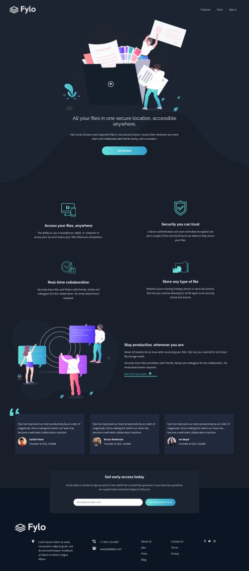
Design comparison
Solution retrospective
Any advice on how to approach the email error handling would be appreciated. Any other suggestions on what to improve would be greatly appreciated.
Community feedback
- @FluffyKasPosted about 3 years ago
Hey, it looks nice but there's a few issues:
-
Hover states are missing from footer links and social media icons.
-
You could use max-width or more padding here and there so your text doesn't stretch that much.
-
For the email validation it's done with a few lines of simple JS, you can find plenty of helpful videos on youtube, for example.
Marked as helpful1@1ZapienPosted about 3 years agoHey @FluffyKas thanks for the great feedback. Adding max width helped make the page look cleaner. I missed the hover states the first time around thanks for catching that. I will look into the email validation with JS. Thanks again.
0 -
- @Shahab-MalikkPosted about 3 years ago
Hi nice work but there are a few problems
-
There should be some margin between links in header as they are designed for mobile devices so they are not looking good at laptop screens.
-
In testimonial section remove the
overflow:scroll
.
Marked as helpful1@1ZapienPosted about 3 years ago@shahabmalik996 Thanks for the feedback. The nav bar does look better with extra space between the links.
0 -
Please log in to post a comment
Log in with GitHubJoin our Discord community
Join thousands of Frontend Mentor community members taking the challenges, sharing resources, helping each other, and chatting about all things front-end!
Join our Discord