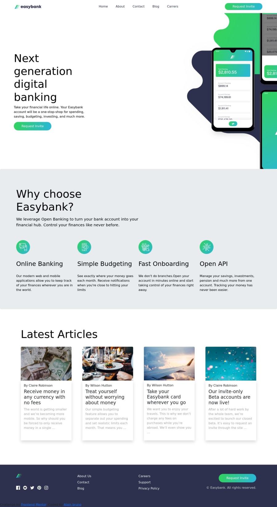
Responsive landing page using css-grid,flexbox,bootstrap and js
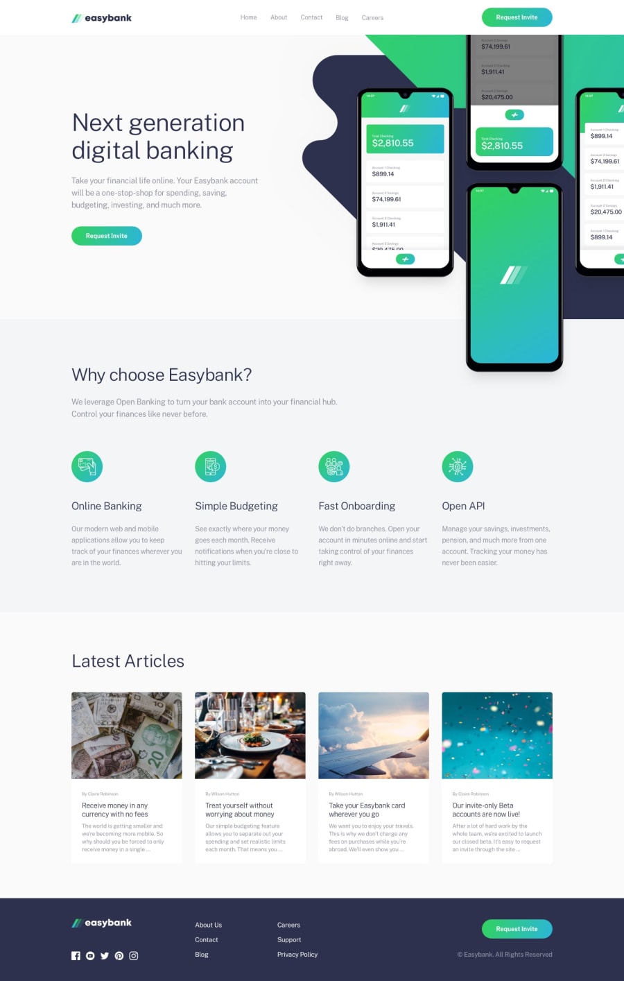
Design comparison
Solution retrospective
This has to be the most challenging project i've worked on yet but it was fun. Any help on making hamburger menu's better will be appreciated
Community feedback
- @Ahmed-ElbaldPosted over 1 year ago
Hi Alain,
1.Concerning the dropdown menu issue, your main problem is that you are giving the
div.dropdownaposition: relative, which makes your dropdown tied to thatdiv. Instead remove theposition: relative, and try to center the dropdown usingleft: 50%; transform: translate(-50%);with some padding. For more info on how to implement that, Consider having a look at my solution2.I've noticed that your navigation links are not wrapped in a
aelement, which is bad regarding the functionality and accessibility of the app. So, instead of<li>Home</li>, try something like<li><a href='/home'>Home</a></li>3.You should edit your headings (h1, h2, h3, ...) a little bit. You can not have an
h6and then anh4right after that like in the article cards. In fact, text like,By Claire Robinsonshould not be a heading. It's more like a subtitle. In your markup, you can place it after the main heading (the article title) and then reverse their order in the layout using theorderproperty.I hope you find that helpful.
Marked as helpful1
Please log in to post a comment
Log in with GitHubJoin our Discord community
Join thousands of Frontend Mentor community members taking the challenges, sharing resources, helping each other, and chatting about all things front-end!
Join our Discord
