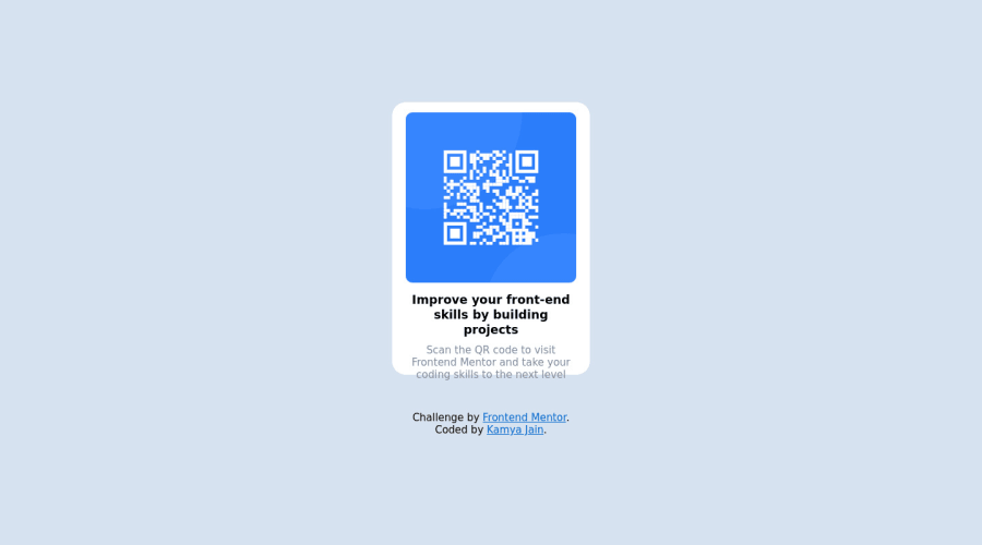
Submitted almost 3 years ago
responsive landing page using css
#angular#bootstrap#django#typescript#express
@KamyaJain
Design comparison
SolutionDesign
Solution retrospective
do check out if i had done the challenge correct or not.
Community feedback
- @NaveenGumastePosted almost 3 years ago
Hello KamyaJain ! Congo 👏 on completing this challenge
Let's look at some of your issues, shall we:
-
Add Main tag after body
<main class="container"></main> -
Always use
h1first and thenh2,h3and so on -
Headings should only increase by one use h1 first then h2 etc..
happy Coding😀
Marked as helpful0 -
- @GitHub-dev12345Posted almost 3 years ago
Good Coding Used this code to improve your project 👍❤️ ; Used this code in your card .main{ height: 650px; background: white; width: 310px; padding : 12px ; margin: 5px auto; border-radius: 20px; } I hope you find this helpful
1
Please log in to post a comment
Log in with GitHubJoin our Discord community
Join thousands of Frontend Mentor community members taking the challenges, sharing resources, helping each other, and chatting about all things front-end!
Join our Discord
