Design comparison
Solution retrospective
I am proud of using CSS variables in this project, and I will learn more about responsive layouts
Community feedback
- @FahithKRMPosted 9 months ago
Great work on this solution! For future reference, please remember:
-
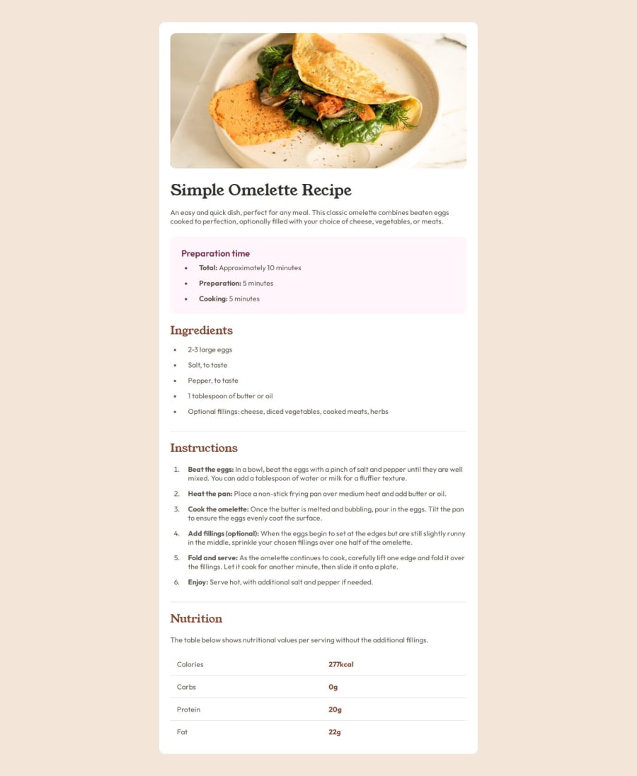
Design Specifications: The design files specify the width for the main part of the card and the border radius that should be used. Make sure to refer to these specifications.
-
Font Weights and colors: Double-check the font weights and color selections to ensure they match the design specifications.
-
Padding, Margin and Box Sizing: You can apply overall padding inside the main container to create appropriate spacing. Be sure to change the box-sizing property to border-box. This ensures that adding padding does not increase the total size of the container.
Marked as helpful0 -
Please log in to post a comment
Log in with GitHubJoin our Discord community
Join thousands of Frontend Mentor community members taking the challenges, sharing resources, helping each other, and chatting about all things front-end!
Join our Discord
