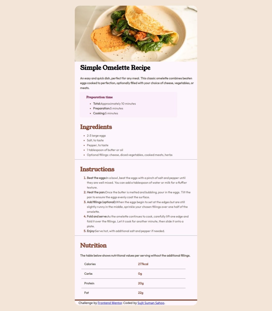
Design comparison
Solution retrospective
Do you have any questions about best practices? Feedbacks are most welcome.
Community feedback
- @DannyEnaguPosted 10 months ago
Hi @SUJIT-DEVFS,
Nice job. But your code can still be improved.
1 Avoid inline styles.
<h3 style="color: hsl(332, 51%, 32%);font-size:16px;margin-top:0">Preparation time</h3>2 Your img alt attribute should contain a short description of the image itself. Also, note that the alt attribute is what screen readers will voice. it will be displayed on the screen when your image is broken.
3 The <div> with the class of container should be a <main> tag. Good practices and accessibility.
4 ul>li>span Use single selectors whenever possible. Always strive for the lowest specificity.
5 Create 3 utility classes for the following:
ul>li>span, ol>li>span{
   color: hsl(30, 10%, 34%);
}

ul>li>b, ol>li>b{
   color: hsl(30, 10%, 34%);
}

ul>h3, ol>h3, h3{
   color: hsl(14, 45%, 36%);
   font-family: 'Young Serif', serif;
   font-size: 30px;
   margin-top: 20px;
}
That's all from me. Hope you find the above suggestions helpful.
Marked as helpful0@sujit-devfsPosted 10 months ago@DannyEnagu Thanks for your review. I will optimize the according to your suggestions.
0
Please log in to post a comment
Log in with GitHubJoin our Discord community
Join thousands of Frontend Mentor community members taking the challenges, sharing resources, helping each other, and chatting about all things front-end!
Join our Discord
