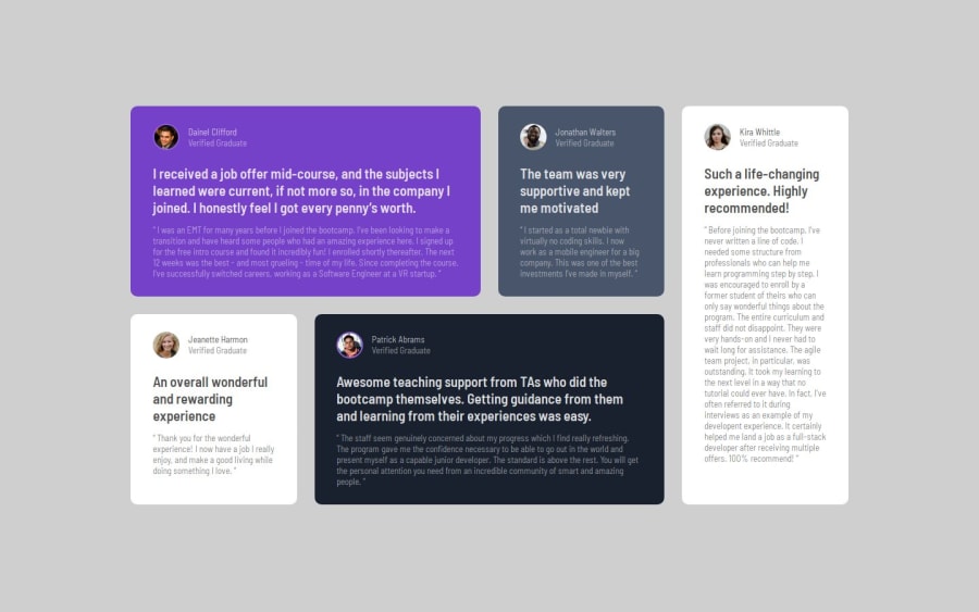
Design comparison
Community feedback
- P@SurajCaseyPosted 6 months ago
Your solution looks amazing. Codes are well structured and readable. Also, the solution matches the design, But, there are few improvements that could be done. They are: You could include <main> </main> to make it more accessible after the body tag. You could add the backgroud color:hsl(210, 46%, 95%); to make it more similar to design.
Marked as helpful1@Shaharyar16Posted 6 months ago@SurajCasey I will try not miss this next time and i realized that i got color wrong after submitting Thank You!
0
Please log in to post a comment
Log in with GitHubJoin our Discord community
Join thousands of Frontend Mentor community members taking the challenges, sharing resources, helping each other, and chatting about all things front-end!
Join our Discord
