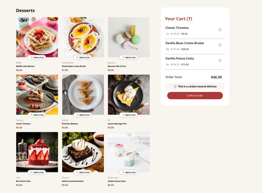
responsive landing page using css grid
Design comparison
Solution retrospective
the fact that i lost enthusiasm, but later encouraged myself to finish the project. i will be more consistent next time
What challenges did you encounter, and how did you overcome them?Nil
What specific areas of your project would you like help with?nil
Community feedback
- @NeoScripterPosted 7 months ago
Hey, Olalois! I checked your solution and here is what I would improve:
-
Your cart doesn't actually work, the items on the left should be added to the list on the right and be interconnected. This is a relatively hard task for a newbie, I don't honestly know why they put in the junior category. You can use localStorage to dinamically update the cart list when the user adds the item to the cart.
-
The add buttons look too small, it's hard to press them, I would recommend increasing their size.
-
The remove from cart buttons don't work, you can leverage localStorage for this task as well. Set up an event listener for each of these buttons, give each item in the list a data-id attribute and listen for clicks. If it's clicked, your code should retrieve the item with this id from a local storage and remove it. I know, it's quite complex to implement, but that's how I would go about it.
-
The list should get empty after the confirm order button is clicked.
I hope these suggestions help, good job creating a layout.
0 -
Please log in to post a comment
Log in with GitHubJoin our Discord community
Join thousands of Frontend Mentor community members taking the challenges, sharing resources, helping each other, and chatting about all things front-end!
Join our Discord
