Design comparison
SolutionDesign
Community feedback
- P@nvallinePosted 11 months ago
Hi,
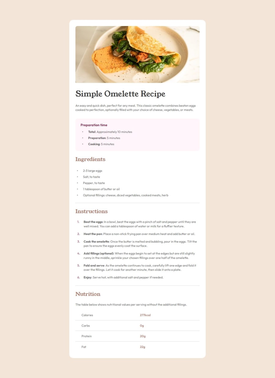
Good job on this challenge, it looks good!
One small thing that I see is in the mobile view (375px side) the title H1 stacks the three words on top of each other. If you play around with reducing the font size of the H1 you'll be able to match up the sizing to that of the mobile design.
Other than that, nothing else jumps out at me.
0
Please log in to post a comment
Log in with GitHubJoin our Discord community
Join thousands of Frontend Mentor community members taking the challenges, sharing resources, helping each other, and chatting about all things front-end!
Join our Discord
